
Showing posts with label infographic. Show all posts
Showing posts with label infographic. Show all posts
Wednesday, 25 January 2017


Tuesday, 26 April 2016
How to Use Facebook for Business: 13 Essential Tips [Infographic]

Facebook is constantly making changes to the design of the profiles -- for businesses and individuals alike. They've made a few cool changes in the past few years, includingadding call-to-action buttons to business Pages and letting you record company milestones, like product launches and events.
There are a lot of ways Facebook is helping brands build a follower base, increase visibility, improve branding, communicate with and engage fans, and even drive traffic and leads.
To learn more about how to use Facebook for business, download our free guide here.
So, what can you do to optimize your brand's presence on Facebook? Check out the infographic below from Cafe Quill for helpful tips on getting the most from your Facebook business Page.

To view the original article Click Here
Friday, 18 March 2016
How to Improve Your LinkedIn Profile and Presence (infographic)
With more than 400 million users on its career-focused platform, LinkedIn is a great place to connect with potential employers and employees. But with only one chance at a first impression, certain elements of your profile and how you use LinkedIn matter more than you may think. And little mistakes can cost you.
Think recruiters don’t pay attention to LinkedIn? Think again: 89% of all recruiters report having hired someone via the platform. While LinkedIn is, in fact, a social media site, your profile, the content you post and the conversations you have with other users should be much more business appropriate than say, Twitter or Facebook. The infographic below details common LinkedIn mistakes (including self promoting or not customizing invitations) and provides smart tips to create the most complete and professional profile possible.
![How to Improve Your LinkedIn Profile and Presence [Infographic] | Social Media Today](https://lh3.googleusercontent.com/blogger_img_proxy/AEn0k_v20f8jxU3R_Cc9Rwy9lBSpVABIPeQAEFUUQ7kfoY0B7vaUETo03LaCMzp9GQryjnzzAskT8KhGOD7cLa2fl8UPXNoTf1u0kF1VuSbZ82CUVdCLG57xOoazm55BWRuPLZoBHwnyTi6FIZk7lR7F5mHA_-VYQOkyU1uGzUwZx6EQcMmjX110WwlmGl5Jq7oKq5ls9mpO_zyPq8b3O8rZAs2Ywjk8Bi2uYOI94kXg08IrWXdeoCx75Cyq3P-p4Aw1Kn1uPobBqxRSjRSvf6z29YL8=s0-d)
From Quill.com
To view the original article Click Here
Thursday, 17 March 2016
How to Pick the Right Social Platforms to Grow Your Sales [Infographic]
The demographics of social media don’t lie: a growing number and variety of people are online and interacting on these sites frequently. And with that in mind, your sales team is no doubt also aware of the potential in reaching out to these audiences using social platforms - but do they know how?
This infographic breaks down 12 different popular sites, including Facebook, Instagram, and LinkedIn, as well as lesser-known sites like Meerkat and Vimeo, and looks at who's actually using them and how. For example, Facebook is best for building a community around your brand, and the majority of its users are college graduates or people who have some college experience.
Another often under appreciated site for salespeople is YouTube. It has over 1 billion users, and the site - even just the mobile site - reaches more 18-34 and 18-49 year-olds than any cable network.
With that knowledge, and more information on the other ten sites featured, your salespeople will be able to better connect with prospects and customers online.
Learn how social media can help drive sales with this infographic.
![How to Pick the Right Social Platforms to Grow Your Sales [Infographic] | Social Media Today](https://lh3.googleusercontent.com/blogger_img_proxy/AEn0k_sFnaML36YRE48uiDb55qBujgIs749ZJwJbDlf3PkZbmehgcYqrhJgpv80yvLuzEdIR0IAo89depLUd4-x1E-SzI3nNZYkhoM2ZwJRHq_ZzT5fmZUrDbtgG6QIXLw8r9c4o1mNoBTEGrV4jO8oI1ppohNKNpA0o20ywsHR6B_D9u70M6QHB0yHNTOn7=s0-d)
To view the original article Click Here
Monday, 14 March 2016
The Ultimate Guide to Infographic Marketing

In the words of entrepreneur and acclaimed author Gary Vaynerchuk, “Marketers ruin everything.”
This couldn’t be more true for infographics, which became a highly popular and effective content marketing tool three or four years ago. While most brands were churning out generic blog content to gain visibility, infographics combined vibrant imagery with succinct text to help educate audiences on a wide variety of topics.
Unfortunately, as soon as we realized infographics could boost brand visibility, the well-researched, carefully written, expertly designed infographics became a small minority in a proliferation of terrible infographics created solely for linkbait. With honest beginnings, infographics were now a value-sucking black hole in the content marketing universe.
This phenomenon led many to decree that infographics are dead, but it’s not true. When properly crafted, infographics, like other forms of visual content, are still highly effective at cutting through the clutter and engaging an online audience. In 2015, 60% of marketers predicted that the use of infographics will increase in 2016.
Thanks to technological advances such as the widespread adoption of mobile internet access, the average human now has a shorter attention span than a goldfish, which makes visual content even more essential for capturing people’s attention. It should come as no surprise that high-quality infographics are liked and shared three times more than any other type of content. So long as your goal is to provide value to your audience rather than generate linkbait, infographics are still highly effective as a content marketing tool.
This guide demonstrates the essential steps of infographic marketing, including choosing the right topic, performing the research, writing the content, design, and promotion.
1. Choose the Right Topic
Once you’ve decided to create an infographic, coming up with a good topic is the first and most important step.
Style First
Thinking of all the different styles of infographics available, and which pertain most to your industry, can help spark some ideas. Timeline infographics are great for demonstrating the evolution of things (such as technologies, philosophies, and biographies). Instructional infographics are useful for breaking down the steps involved in completing a task. Comparison infographics place two concepts side by side and explain the differences (think entrepreneurs vs. employees or capitalism vs. communism). Spend some time browsing infographic directories such as Nerdgraph and Visual.ly, analyze the styles of infographics on display, and you’re sure to come up with some ideas.
Trending Topics
You’re probably able to think of a trending topic in your industry which could be elucidated with a powerful infographic. If you can’t, check out Google Trends, and learn about what topics are receiving the most search inquiries right now. Tools such as Buzzsumo, Digg, and Reddit are also useful for sparking ideas for an infographic topic. For industry-specific content, LinkedIn Pulse is also worth checking out.
Repurpose Old Content
Go through your old blog posts, presentations, and white papers. Content that received high levels of engagement could be worth revisiting and repurposing into an infographic. List posts about evergreen topics are always great candidates for repurposing. If you have customer survey data that provides insights into your industry, conveying it as an infographic could be highly effective.
Switch Angles
If there is already a popular infographic on a particular subject, it’s not wise to cover the same tracks (unless all the other infographics on the subject are terrible). Instead, you may wish to tackle the topic from a different angle, such as taking the counterargument. Although it’s best to avoid deliberately offending people, sometimes a bit of controversy is good for engagement. If a topic has two polarizing arguments, picking a side may result in a more fervid response (One of our most popular infographics is on the highly polarizing and emotionally charged subject of veganism).

One final word of warning: You should never create an infographic simply to promote your brand, products, or services. These kind of infographics never gain any engagement and are a waste of your resources. Infographics should always be created with the intention to give value rather than receive it.
2. Research
Your sources are the lifeblood of your infographic. Without credible sources, your narrative has no legs to stand on and will be immediately dismissed.
Facts and Statistics
Look within your organization for data that can be conveyed visually. Customer survey data, statistics from sales reports, and information about industry trends can all be used as sources to corroborate your infographic. If your budget enables it, you may even wish to commission a market research report to serve as the foundation for your infographic.
Depending on the topic of the infographic, there are many online resourceswhich can provide you with useful data. For statistics about poverty in the developing world, World Bank has an abundance of information. If you’re looking for statistics about particular geographic regions or cities, Geob.ase is the place to go. Google Trends is great for demonstrating the growing interest in a particular subject, and The Census has some really interesting data about the population of America. For finding evidence from peer-reviewed journals and other scholarly literature, Google Scholar is highly recommended.
When citing facts and statistics, always ensure they’re recent and from credible sources. Evidence from peer-reviewed journals is always taken more seriously than evidence from a Wikipedia article. Always cite your sources in the footer of the infographic to show that you aren’t fabricating anything.
Quotes
While quotes are inherently subjective, so long as they’re credited to industry experts and thought leaders, they can really help boost the credibility of your argument. Never underestimate the power of social proof. You may wish to sprinkle some quotes throughout your infographic, particularly if they are witty and humorous. While empirical data is the best foundation for infographics, quotes are a great way to inject a human element into your argument.
3. Write
Once you’ve assembled a variety of compelling facts and statistics, it’s time to work them into a powerful narrative.
Thinking Visually
The key to great infographic copy is thinking visually2. (highlight to tweet) The text needs to be succinct enough to support the visual elements without drawing attention away. For this reason, it’s best to use a copywriter who has a background in design or is experienced at writing infographic content. This is not the time to showcase your flashy vocabulary or intricate wordplay. When it comes to infographic copy, “Don’t say it; show it,” rings true.
Constructing a Narrative
Without a powerful narrative, you will end up with a bunch of disconnected data points and a confused audience. A narrative enables your readers to go on a journey through the infographic and leave feeling enhanced. The best place to start is by putting yourself in the shoes of your target reader and then consider the objective of the infographic (i.e. to educate or entertain). Next, reverse engineer the content accordingly. Ensure that your narrative fluidly moves from point to point, allowing your readers to soak up the information before arriving, unrushed, at your conclusion.
The headline of your infographic should deliver immediate impact, promising to impart valuable knowledge or definitively answer a question. The introduction is usually the most text-heavy part of an infographic and should summarize what’s to follow in two or three sentences (if possible). For the same reason list posts are so effective, subheadings help to break up your infographic into digestible chunks and move your readers from one section to the next.
Proofreading
It sounds obvious, but spelling and grammar mistakes can really destroy an infographic. After your copy has been finalized, ensure you proofread thoroughly and invite someone else to give their opinion. If you’ve worked tirelessly on your copy for days, it becomes increasingly difficult to spot your own mistakes. This is why a second set of eyes is of vital importance. Unlike a blog post which can be immediately edited, you definitely won’t want to find any spelling mistakes on your infographic after it’s been published and circulated!
4. Design
Design isn’t just about creating a beautiful aesthetic—it’s also about functionality. For this reason, it’s best to sketch out the content as a wireframe design in order to ensure your narrative works in a visual context.
Clarity
An infographic cluttered with images, text, and data points is not appealing to the eye and kills the primary goal of the infographic (explaining a concept or imparting knowledge using visual cues). Don’t be afraid to incorporate plenty of negative space around the elements of your infographic—this will improve its readability. When visual elements come too close to the edges of your infographic, things can start to look sloppy, so always leave a consistent margin of free space around the edges throughout.
An infographic is typically 800–1000 pixels wide and much longer in length. If you need to add more content, expand the infographic vertically rather than horizontally, as an unusually wide infographic will be more problematic to share.
Colors and Fonts
Colors impact on our mood and alter our perception of a piece of art. It’s important to choose a color scheme that fits the theme of the infographic. If your infographic is about a serious topic such as mental illness or poverty, skip the bright, flamboyant colors. For infographics about the environment, earthy tones are always a good choice. Don’t be afraid of contrast, and pick a color scheme of two to four colors—any more than this, and your infographic can quickly become an eyesore. Colourlovers is an excellent resource for determining a color scheme for your infographic.
Consistency is also important for the text, and you should avoid using more than three fonts (ideally two) throughout. There’s no need to use the standard font associated with your brand; the goal of the infographic should be to provide value to your audience, not promote your company.
Conveying Data
So long as they fit the style of the infographic (and don’t look like they were plucked straight from Microsoft Excel), pie charts and bar graphs are acceptable choices for conveying data in an infographic. However, there are more unique ways of doing things. A skilled designer can turn an icon which pertains to your topic into a data visualization (dashboard gauges and clocks are a common choice).

Image via How Seasteading Can Improve The World
Ultimately, the way you choose to represent data can be exciting and unique, but the primary objective should always be to highlight key trends as quickly and effectively as possible. If a traditional bar chart functions better than a flashy pressure gauge, then so be it.
Icons
A quick search for infographic-related terms in Shutterstock will bring up an enormous amount of vector art that you can include in your infographic. While some infographic sets come with a significant price tag, you may find it economical in the long run, as you use the same elements time and time again for different infographics.
While originality is important, there’s nothing wrong with using someone else’s icons (unless they don’t simply work with the illustration style of the infographic). Just ensure you don’t use cheap icons, and always pay for licenses—it’s not worth putting your brand in a precarious legal position to save a few bucks.
Branding
Because your infographic will be targeted for an external audience, you don’t need to worry about overtly branding the infographic. Instead, simply include your company logo and web address in the footer of the infographic next to the sources. This enables readers to find your site even if some people repost the infographic without linking back to your site.
5. Promotion
Once your infographic is complete, and you have something truly worth sharing, use the following tips to create as much engagement as possible.
Landing Page Optimization
Ensure your landing page is as user-friendly as possible. Include social media buttons underneath the infographic so people can share it via their favorite platforms (such as Twitter, Google+, Pinterest, and Facebook). You may wish to include some tweetable quotes from the infographic on the landing page, so people can share the facts they find most interesting. Provide your readers with an HTML embed code underneath the infographic, so they can easily feature it on their own sites, should they choose to.
Infographic Directories
There are a number of infographic directories that would be proud to display your new infographic to their audiences. This will result in a new backlink and, hopefully, an increase in traffic to your site. Always remember to follow each site’s submission instructions carefully and prepare a succinct introduction to accompany your infographic.
Blogger Outreach
Bloggers are always looking for high-quality, contextually relevant visual content to show to their audience. So long as the topic of the infographic is actually interesting to people, you should be able to find a list of articles about similar topics with a quick Google search. Simply contact the site owners of each blog post you find, tell them that you came across their article while performing some research, tell them what you liked about their article, and then ask them if they’d be interested in seeing an infographic on a similar subject.
This is not an aggressive request for them to repost your infographic and provide you with a backlink. Instead, you’re simply offering them an awesome piece of visual content that their audience will appreciate (This is why your infographic needs to actually be awesome). If they request to see the infographic, and they like it, then you can make the pitch for them to republish it. By offering them a unique guest post to accompany the infographic, they will be more likely to approve your pitch.
If you feel your infographic would be relevant to your mailing list, drop them a message with a thumbnail of the infographic included, and link back to your landing page. It’s best to bring people to your site to view the infographic, since this encourages them to share it via your conveniently placed social media buttons. If your infographic relates (hopefully not too overtly) to any of your products or services, help your readers find their way to the relevant pages.
Social Media
When you post the infographic on Twitter and Facebook, always include a thumbnail image and a hyperlink back to your landing page. Different social media platforms have different image restrictions, so tailor each thumbnail individually. You can post the link to the infographic several times with different thumbnail images from important parts of the infographic. Always use relevant hashtags when posting on Twitter to improve engagement.
For Instagram, it’s best to post the infographic in sections due to dimensional restrictions. You can even create your own YouTube video that scrolls through sections of the infographic, although this should only be attempted if your video editing skills are up to par.
SlideShare is another great platform for posting chopped-up pieces of your infographic in the form of a shareable presentation. If you do wish to convey your infographic as a presentation, it’s best to let your designer know in advance, so they can accommodate for this from the start. If you quoted any experts within the infographic, don’t forget to let them know about it via Twitter—they might give you a valuable retweet.
While traditional, direct marketing strategies involve making as much money from people as fast as possible, the philosophy of content marketing is that the more great content you produce, the more people will respect your expertise and trust your brand, which leads to conversions in the long run.
In other words, sustained revenue and brand reputation is a marathon, not a sprint. In order to be successful in the digital era, awesome content is essential.Research indicates that 73% of content creators plan to prioritize creating engaging content this year, and 55% plan to prioritize creating visual content.
So long as you’re in this for the long haul and genuinely wish to provide value to your audience, infographics can be a great asset in your quest for success.
To view the original article Click Here
Friday, 11 March 2016
6 Surprising Statistics on Social Selling [Infographic]

Sometimes it pays to be an early adopter of new technology. But other times, jumping on the bandwagon too soon can spell disaster when things take an unexpected turn.
Social selling is by no means a new phenomenon, but adoption among sellers is still the exception to the rule. Why research a prospect on LinkedIn or Twitter when a rep can simply pick up the phone and find out everything they need to know? And the last time I heard, people still read and answered their emails. Maybe incorporating social media into the sales process is just an overblown fad, and those who hop on the social selling train too soon will regret their actions sooner rather than later.
Well, technically anything's possible, but the data sides in favor of social selling. If you haven't yet started to weave social media into to your day-to-day sales processes, check out the following infographic from Sales For Life which features six eyebrow-raising statistics on the forces behind social selling.
Not sold on social selling? Consider that buyers who engage on social media have far bigger budgets than those who don't -- 84% bigger, to be exact. Or that sellers who use social far outpace their non-social selling peers in terms of quota attainment. It's not too late to climb aboard the social selling train -- get started today.


To view the original article Click Here
Wednesday, 9 March 2016
How to Create a Sensible Social Media Strategy for Your Business [Infographic]

Many businesses find social media overwhelming - there are so many networks available, and they’re always adding new features for you to learn and integrate into your plan. If you don’t have a full-time team of social media experts at your disposal, your success depends on creating a simple and sensible strategy that fits your resources and goals.
Here are a few steps you can take to focus your energy:
1) Define your target audience
If you haven’t already identified and documented your buyer personas, start by defining the key demographics of the audience you’re trying to reach - age, gender, occupation, income, hobbies and interests, etc. Think about the challenges they’re faced with, and what problems they’re trying to solve on daily basis. Try to focus on the 3-4 types of people that represent the majority of your buyers - don’t get hung up on all the exceptions, or you’ll never get started!
2) Start blogging
Fresh content is the linchpin of a successful social strategy, so you’ll need to commit to creating fresh, quality content on a consistent basis. Brainstorm a list of the most common questions you hear from your prospects, and commit to writing at least one new blog post a week focused on addressing these questions.
3) Create educational content
Consider creating downloadable content like ebooks, checklists, videos, and infographics that address your buyer’s pains. If the content is truly helpful and educational, people will be more likely to share it on social media and extend your reach.
4) Focus on a few key social channels
Most small businesses don’t have the bandwidth to establish and sustain a great social media presence on more than a handful of channels. It can also be overwhelming to learn the rules of engagement on a bunch of different networks at one time. Start small. Research key networks to learn where your target audience is most likely to spend time, and focus your effort on building, nurturing, and sustaining a community there before moving on to another channel.
5) Develop a recipe card to guide you
Social media isn’t an exact science, so you need to establish a consistent posting and engagement schedule to start seeing results. Start by developing a reasonable recipe card you feel comfortable sticking to. Set goals for how frequently you'll post content and engage your followers, and hold yourself accountable to following your recipe.
6) Measure your results
There are a million things you can track related to social media, so start by looking at how much traffic is being driven to your website or blog from social media. Watch your posts to see what people are responding to, and look for trends related to particular topics or keywords that generate more interest than others. Once you have a sense of what's possible, set goals for key metrics and start keeping a scorecard to measure your progress. Be sure to chose metrics that are easy to gather - if it's too time-consuming to track, you'll fall off the wagon!
- Net new fans and followers
- # of interactions
- Visits to your site from social
7) Adjust your tactics
Unless you're a celebrity, social media doesn't start working overnight. It takes time to build a following, establish yourself as an influencer, and start seeing results. You'll need to experiment a bit to find the right combination of channels, content, and messaging that works for your audience. Over time, you’ll be able to adjust your recipe card, content, and personas based on the information you’re gathering - which will help you fine tune your strategy and generate more consistent results!

To view the original article Click Here
Thursday, 11 February 2016
The History of Google’s Biggest Changes over Time [INFOGRAPHIC]

The biggest change in search marketers’ lives is arguably how search has morphed and is becoming more and more integrated into our daily routines. While Google innovates, we find ourselves harder to keep up.
For example, do you remember Yahoo and MSN were the alternate competitors to Google? Then, MSN (amongst many rebrands) became Bing all to leave Yahoo in the dust start taking back some search share. Or do you remember how searches were about “things” vs. “strings”? For example, we used to type “lumber utah” to find firewood for sale in Sandy, Utah. Now we ask Google “Where can I find lumber for sale for my fireplace near Sandy, Utah?” Voice search has aided the morphology of that.
Today, what we say and ask Google starts to matter less and less. Google tries to understand us before we even ask. It’ll morph or results based on our location, device we’re using, previous behavior, and more. It’s truly an engine of matching intent vs. matching keywords these days. And, of course, that’s changed how SEOs work.
Watching those keyword rankings go up and down are no longer as meaningful as they once where. Below, my company MWI highlighted some of the most common theme changes over time.
Let us know in the comments if you know of any others.

To view the original article Click Here
Wednesday, 3 February 2016
How to Effectively Use Remarketing (Infographic)
It seems that each year that passes brings some new forms of advertising that marketers can add as another tool in their arsenal.
These past few years have brought native advertising to the mainstream, which comedian John Oliver analyzed this past August:
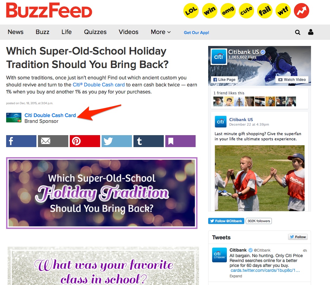
Native advertising has taken hold online. Here’s an example from Buzzfeed:
This native advertising happens offline as well. You’ll find it in newspapers, magazines and hear it on the radio (it’s sneaky).
The web has also exploded with the growth of exit intent popups. Hover your mouse near the top of the browser to close or switch a tab and out of nowhere comes a near full page ad asking the visitor for something before they leave – typically an email address. Here’s an example, courtesy of 2xecommerce.com:

In recent years we have also seen the growth of retargeting. This purpose of this is to advertise to people who have previously visited a specific site.
For example, let’s say you visit amazon.com today, place a few items in your cart, and leave. A few days later you’re browsing nytimes.com and see an Amazon advertisement with the products you put in your cart. You can then click the ad and are directed back to Amazon, and complete your purchase.
Sound like a new channel you’d like to test? Neil Patel of Quick Sprout has created an infographic to help you out. Whether you’re just diving into retargeting or have been around the block a few times and want a refresher on some of the principles.

Courtesy of: Quick Sprout
To view the original article Click Here
Tuesday, 2 February 2016
A Case for Social Selling: How It Can Increase Revenue, Productivity & More [Infographic]

This post originally appeared on HubSpot's Sales Blog. To read more content like this,subscribe to Sales.
What if I told you that the key to increasing revenue, employee productivity, and lead flow was as simple as sending a tweet?
The modern buyer is changing and starting to rely on social media for input and information on products and services. In order to keep up, sales reps need to adjust accordingly and meet buyers online to build a relationship and convert them into customers.
Bearing buyers’ behavioral changes in mind, social media has become an incredibly powerful tool for sales. For example, did you know 40% of salespeople close two to five deals per year as a result of social selling? Or that companies that invest in social selling have seen their revenue growth double?
But the numbers don’t stop there. For more information on social selling and the “why” behind it, check out the following infographic from PostBeyond.com.

To view the original article Click Here
Subscribe to:
Posts (Atom)