Showing posts with label opt-in page. Show all posts

Friday, 1 April 2016

10 Creative Places for Opt-In Forms That’ll Supercharge Your Signups


10 Creative Places for Opt-In Forms That’ll Supercharge Your Signups


Let me guess.

You signed up for Mailchimp, AWeber, or Constant Contact and created an opt-in form to snag yourself some new subscribers for your blog.
Maybe you even went the extra mile and created a juicy opt-in offer to tempt them to hand over their precious email addresses.
Then you posted it on your sidebar and in your footer, and maybe you were smart enough to throw up a feature box too.
And now you can’t figure out why the subscribers aren’t rolling in.
Every morning you anxiously check your email dashboard, hoping that today will be the day you finally see a ton of new signups.
But every morning is a letdown. Just one or two new subscribers (and let’s be honest — it’s just one if you don’t count your mom).
The truth is, these tactics used to work wonderfully — but they don’t any more.
Your readers have evolved, and your blog needs to adapt.
But how?

Why Opt-In Forms Don’t Work Like They Used To

Not long ago you could put opt-in forms in all of the obvious places on your blog and expect a pretty good signup rate.
However, this passive form of collecting opt-ins doesn’t work anymore.
You can’t just collect subscribers like a barrel collects rainwater. You have to capture them.
That means first you must get their attention. Because most readers have developed “opt-in form blindness.”
When almost every blogger is posting opt-in forms in the same places, we tend to block them out. It’s just the way our brains work.
I have an uncle who lives close to a hog farm. He can’t smell a thing, even though we suffocate whenever we visit him. He’s been exposed to “hog farm smell” for so long that he doesn’t notice it anymore.
After a while, we ignore what’s familiar. That’s why you need to think outside of the box to get your call to action in front of your visitors.
Here are eight creative places to put opt-ins on your blog to jolt you out of your subscriber-gaining rut.

1) Right Under Your Headline

Your headlines are the first point of contact between your audience and your posts. They catch the readers’ eyes, pique their interest, and draw their gaze down the page.
Leverage that attention you snagged with your killer headline by inviting your readers to subscribe to your email list underneath the headline of your blog post. That real estate is often needlessly sacrificed to name and date information.
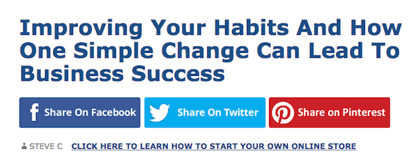
Steve Chou from MyWifeQuitHerJob.com uses this method on his blog:
Opt-In - Image 001
This allows him to capitalize on the attention he has already generated with his headlines.
Do the same on your website with your opt-in form to reach readers when they’re the most captivated.
This requires some minor theme customization to add the correct link to your byline, but if you don’t know how to do that sort of coding, you can always hire somebody on Fiverr.

2) Beneath Your Comment Form

Your readers get all the way to the bottom of your post.
They’re interested, and engaged enough to want to scroll down and leave comments.
Now, imagine if each person was automatically signed up to your email list after leaving a comment.
It would be pretty sneaky, for sure, but it’s still tempting, right? After all, they’ve just typed their email address in the comment form — the piece of information you desperately want.
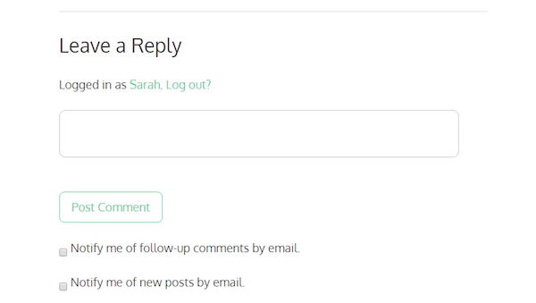
But while you can’t sign them up without asking (sorry kids), you can make it super easy for them to sign up if they want to — with a simple check box.
Opt-In - Image 002
I use this method on my blog to capture the emails of those who comment, should they be interested in subscribing. Which they usually are, if they are willing to go to the trouble of leaving me a comment.

3) On a Fancy “Welcome Mat”

Quick test:
When readers land on your website, how many choices do you give them?
My guess is you probably give them a lot to choose from — and you might not even know it.
See, every single action that your visitors can take on your website makes the decision of which one to take, harder. That means that every link in your menu, every widget in your sidebar, every headline, picture and button is in competition for your visitor’s attention.
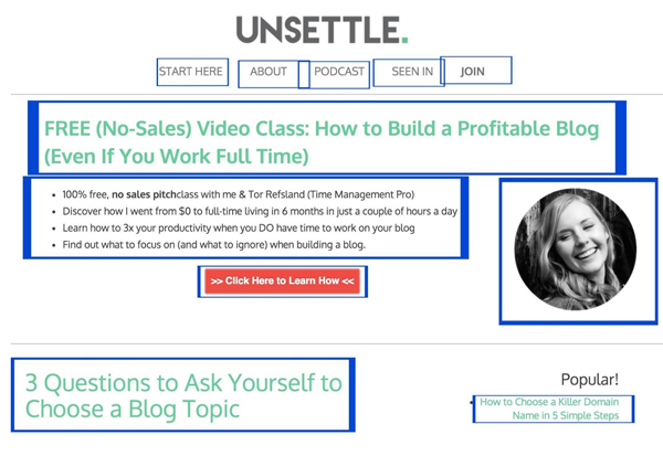
I know better than to pull my visitors’ attention in too many directions, but I still give them 11 choices of what to do on my home page:
Opt-In - Image 003
That’s a lot of decisions!
Studies show that when presented with too many choices, we choose none of them. That’s why isolating your opt-in opportunity works so well — and you can do that using a Welcome Mat.
A Welcome Mat is a free tool by SumoMe that acts as a “squeeze page” or landing page by rolling down to welcome visitors to your website when they land on a specific page of your choice. This eliminates all other distractions, but it doesn’t break the readers’ attention while they’re digging into your article.
You can also use the “instant landing page” feature to make it a landing page, so visitors don’t miss it when they scroll down.
When you isolate your call to action like this, you’re removing all of the choices your visitors have to make and presenting them with only one choice: will they opt in, or not?
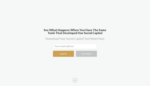
The Art of Charm has used this method on its home page:
Opt-In - Image 004
The Welcome Mat invites you to sign up for a Social Capital Tool Sheet when you land on the website. If the visitor doesn’t want to sign up, they can either scroll down, click the arrow, or click “no thanks” and the blog will re-appear.
This is not the same thing as a popup, incidentally. A Welcome Mat is like a red carpet that rolls out the moment you step up to the door; a popup is like an annoying rug that suddenly shows up and trips you halfway down the hallway.

4) In a Custom Sidebar

When somebody lands on an article on your blog, they see the same sidebar that you have on your homepage.
Maybe it has a photo of you. Perhaps it even has a freebie or an opt-in offer. But overall, it looks like a boring old sidebar for a boring old blog.
So what if you jazzed up your sidebar a bit? What if you could have a customized sidebar depending on which article your visitor lands on?
That’s right, a custom sidebar with a custom opt-in offer, targeted precisely at the people who are interested in what you’re teaching in that article.
In other words, the perfect “content upgrade.”
A content upgrade is when a blogger creates a complimentary resource for their blog post and offers it as an “upgrade” delivered via email. These can help you grow your list quickly– so imagine what you could do with sidebars like this!
The couple behind Screw the Nine to Five use custom sidebars to host an image of a content upgrade perfectly paired to the post you’re reading:
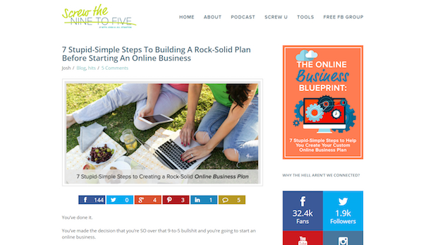
Opt-In - Image 005
It’s different from the normal sidebar, shown below:
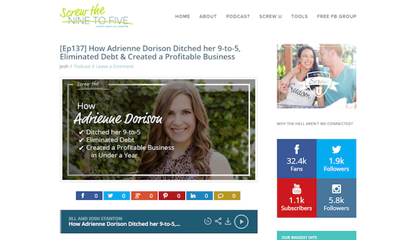
Opt-In - Image 006
This technique will make your readers go from “Hmm, that’s interesting,” to “Whoa! I want that!”

5) In Your Main Navigation Menu

If you checked your analytics right now, chances are you’d find that your “About” page is one of the most popular pages on your website.
Usually, people will read a post on your blog, and then get curious about who you are. They’ll move up to your navigation menu and click on your “About” page.
Why not use some of that navigation bar momentum and place a link to opt into your email list as well?
Your menu is prime real estate on your blog, so use it!
Nat Eliason uses this method on his website to promote his newsletter:
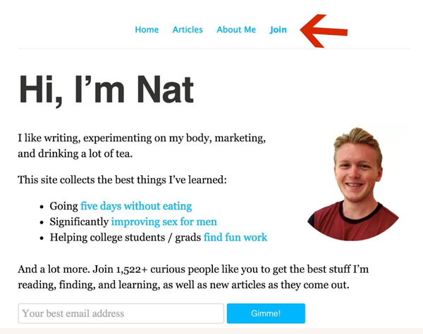
Opt-In - Image 007
You can also promote your opt-in offer in your menu bar, like Assya Barrette does for her free minimalism and green living challenge:
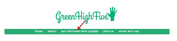
Opt-In - Image 008
This is one of the most simple opt-in opportunities to implement as it can be done right in your WordPress dashboard under Appearance > Menus > Custom Links. You can change the color, font, and size of the link with HTML to make it stand out.
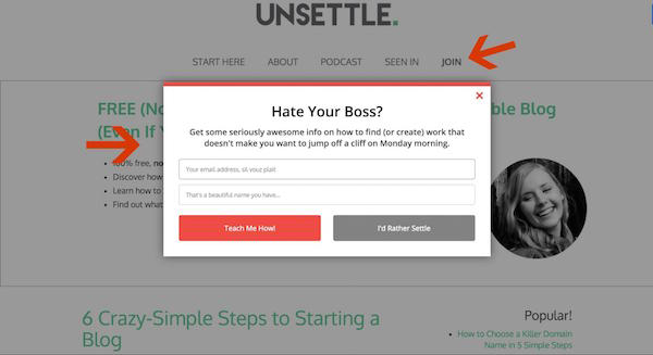
You can either add a link to a landing page that collects emails, or create a two-step opt-in process as I have with mine, where the visitor clicks the button and brings up an on-page opt-in form:
Opt-In - Image 009
You do this by clicking the “Join” button on my menu, which brings up this pop-up.
If you have a LeadPages account, you do the two-step opt-in process with a LeadBox. If not, you can do it in the SumoMe List Builder app with a Click Trigger.
This converted between 5% and 18% for me over the past week.

6) Above Your Blog Footer

If you’ve ever seen a scroll map or content analytics about your website, you’ll know that some people don’t make it to the bottom of your page.
On the plus side, you can be sure that those who do are definitely interested in what you’re doing. So grab that forward, action-taking momentum by the horns and give those people an option to subscribe to your email list at the bottom of the page.
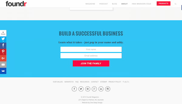
Foundr does this by including an opt-in box above its footer:
Opt-In - Image 010
Everyone else puts their bottom-most email capture form in the footer itself. But remember, your Internet-savvy readers are filtering out that common stuff. To keep their attention, always put your capture form above your footer rather than in your footer.

7) On Your “404 Not Found” Page

How many times has this happened to you?
You’re browsing a website and really enjoying the content. You see a link to a post that looks interesting, and you click it…
Only to be taken to a 404 page and told that no such page exists.
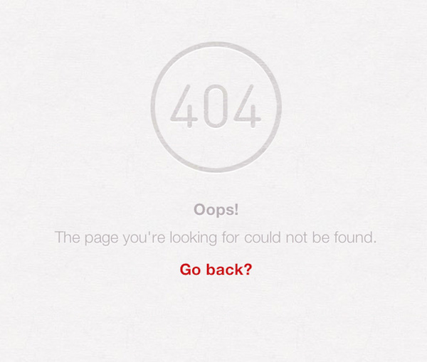
Broken links can happen to the most diligent of bloggers, and when they do, readers will see something like this:
Opt-In - Image 011
Pretty unfriendly, right?
Most people will bounce from your 404 error page. They were running on your blog’s content like a treadmill, feeling a sense of flow. Suddenly, the treadmill shuts down. To get started again, they have to go through the trouble of resetting everything: browsing back, finding their place, and figuring out where to go next.
So they figure, why not skip the trouble and end the workout there? Their momentum stopped abruptly, and chances are they won’t return.
Turn this flop into an opportunity. Most 404 pages just tell you there’s nothing there. But why not give your reader something else to do on your 404 page? Something like subscribing to your email list?
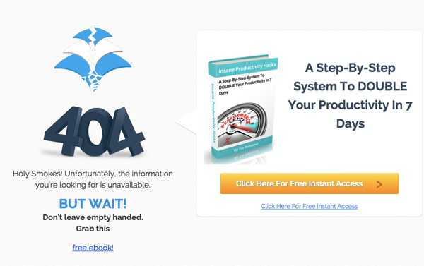
Tor from Time Management Chef optimized his 404 page to tell readers that they’ve 404’d, but also to offer them something, so all is not lost:
Opt-In - Image 012
This trick helps you capture the people who were already engaged enough with your website to have performed a search or clicked around.
You can create an optimized 404 landing page with a tool like LeadPages or ThriveLeads. If you don’t have a landing page tool, you can turn any WordPress page into your 404 page using this plugin.

8) In Your Post Excerpts

I talked earlier about putting content upgrades in custom sidebars and, of course, content upgrades are not a new idea.
Many bloggers use this strategy to grow their email lists, but almost all of them incorporate the call to action for the content upgrade at the end of the post itself. This means you miss everyone who doesn’t make it to the end of the post — all the “scanners” and those who were pulled away in the middle by some distraction or another.
So instead of using the same strategy as everyone else, why not include the content upgrade in the post excerpt on your home page by placing it at the top of the post before the “read more” button?
This captures the attention of all the visitors who land on your homepage — not just those who make it to the very end of your post.
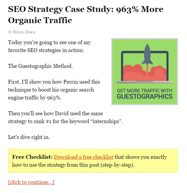
Brian Dean from Backlinko.com uses this strategy on his home page with his “Free Checklist” box:
Opt-In - Image 013
This entices readers to click on the blog post as they can see that it has extra value. It can also convert readers much sooner instead of relying solely on them noticing your link at the bottom of the post.
You can create a box like this by inserting an “alert” paragraph class in the HTML of your blog post and then linking to a popup or landing page within the “alert.”

9) Within Your Blog Archives

Have you ever landed on a blog that led you down a rabbit hole? You read one post, and then another post, which led you to the archives — pages and pages of them — where you found yourself spending hours reading whatever caught your eye.
If you’re impressed enough with the content of the blog to go back into the archives, I bet you’d also be far more likely to sign up for the blogger’s email list if they gave you the opportunity.
That’s where your own archives come in.
Instead of just relying on your home page to do all the heavy lifting, incorporate an opt-in form on your archive page, too.
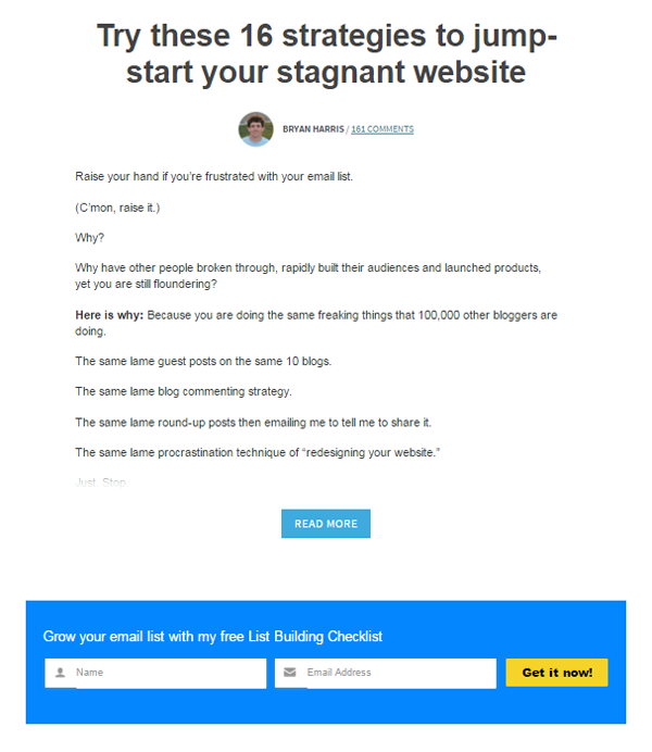
Bryan Harris from Videofruit.com does this, as you can see in the screenshot below. His opt-in form offers a free list-building checklist, which fits right into his archives related to list-building:
Opt-In - Image 014
When readers are binge-reading your content, it’s a good sign. It means you’re doing something right! Don’t let it turn into a one-time-only binge; use their enthusiasm as an opportunity to capture their email addresses.

10) On Your About Page

As I was saying earlier, your “About” page is one of the most visited pages on your website, right?
And you’ve probably worked hard on it to keep your visitors’ interest and share a bit more about you and what value they’ll get from your blog. So why not harness that “getting to know you” vibe by asking them to subscribe to your email list?
Not including opt-in forms on your “About” page is like meeting somebody at a party who you really hit it off with, and then leaving without ever getting their phone number. So be sure to include opt-in opportunities at least once or twice on your “About” page.
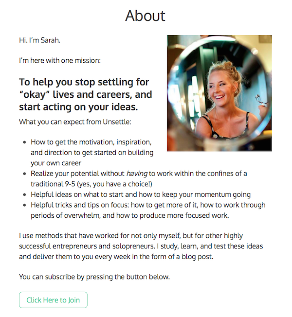
I have a button to an opt-in box on mine that converts at 52%:
Opt-In - Image 015
What’s more, the subscribers who opt in from my “About” page tend to be more engaged with me, because they feel as if they already know me.
Capture the people who land on your “About” page so you don’t miss the chance to connect with them over the long term.

Don’t Let Your Blog Visitors Become Missed Connections

You know that section on Craigslist called “missed connections”?
It’s where people reach out to those they wish they had connected with in person, though usually it’s too late.
That’s the way it is on your blog when you don’t capture your readers’ email addresses. They become missed connections.
So instead of letting your casual visitors slip through your fingers, never to be seen again, grab their attention and do something with it.
Put your opt-ins where readers least expect to find them, then capture their email addresses so you can begin to build meaningful relationships.
Because there is no “missed connections” page for lonely bloggers.
To view the original article Click Here

Tuesday, 8 March 2016

When It Comes To High-Performing Landing Pages, It’s Not Long Or Short. It’s This…

High performing landing pages, short form or long form.


If you’ve worked in the conversion optimization industry for longer than say, fifteen minutes, you’ve almost certainly stumbled across someone making the argument for longer sales pages. Or shorter sales pages.
It usually sounds something like this…
“People have short attention spans. Who’s going to read something this long?”
“Long pages are ugly. What’s with the yellow highlighter?”
“You should never make customers scroll to find what they’re looking for.”
Or, from the other side…
“Basecamp uses a long sales page. Shouldn’t we follow best practices?”
“Longer pages let you tell the whole story.”
“Long pages give busy people information to skim so they can pull out what’s important to them.”
There are smart arguments (and smart people) on both sides of this ongoing debate. Which can make it hard to figure out who’s right. And who’s not.
When The Daily Egg asked several experts for their thoughts about long sales pages, they got responses like…
“If long copy sales pages are not a thing of the past, they should be. It seems evident that people have short attention spans, so the best way to convert them is to sell them on the product as quickly as possible.”
—Kristi Hines,  Freelance Writer
And, advocating for long pages…
“…the sales letter must support several different modes of reading, including: scanning, partial attention, and engaged reading… the methodical reader must be captured and taken though the page in a more traditional sales letter approach.”
—Bryan Massey, Conversion Sciences
And, when push comes to shove, the long copy advocates pull out the biggest gun of all:
“Direct response advertisers know that short copy doesn’t sell. In split-run tests, long copy invariably outsells short copy. But I must warn you that if you want your long copy to be read, you had better write it well. In particular, your first paragraph should be a grabber…
Long copy sells more than short copy, particularly when you are asking the reader to spend a lot of money. Only amateurs use short copy.”
—David Ogilvy, Founder Ogilvy & Mather
“Only amateurs.” Argument settled, right?
Maybe not.

What Do Scientists Say About Long And Short Sales Copy?

Given that the argument about long and short copy dates back to at least 1923 when Claude Hopkins published Scientific Advertising, you’d think that academics would find this a rich area for study.
But you would be wrong.
Maybe academics aren’t interested in studying these critical questions. Or maybe they’re too busy doing even more important work, like identifying gravity wavesand finding the Higgs Boson particle.
But that’s not to say that no one has studied this.
One team of researchers found that longer messages on banner ads are associated with higher click-through rates. But even long banner ads are barely long enough to qualify as short sales messages.
second team of scientists found that readers of an industrial magazine were significantly more likely to read ads containing long, rather than short, copy. The researchers “found that short copy is less effective in arousing the interest of readers. The results suggest that longer ad copy is needed to communicate the type of information sought by industrial prospects, empirically confirming beliefs held by the advertising industry.” But, single-page ads aren’t that long.
A third study, published in the Journal of Interactive Marketing took a look at two sales letters in a direct mail campaign and found that a two-page letter performed no better than a single-page letter. But again, most marketers would argue that a two-page letter is “short.”
Sadly, academia doesn’t have much to offer here.
Fortunately, online marketers do.

Internet Marketers Have Been Testing This Stuff For Years

Forget cat memes, streaming video, and Facebook. The best thing about the Internet is data. For marketers, the ability to measure everything from scrolling and clicks to conversions and revenue has changed the game.
And that means we can easily see how short pages perform when compared to long pages.
Here’s what a few tests have revealed…

Example 1: Crazy Egg Kills It With Long Copy

Readers of The Daily Egg will certainly be familiar with this test. In fact, thanks to Neil Patel, it may be the most well-known test of long and short copy ever conducted.
In an effort to increase conversions on Crazy Egg, founders Neil Patel and Hiten Shah approached Conversion Rate Experts for help. CRE took a look at the existing page and identified several areas for improvement.
They discovered that visitors weren’t always clear on what Crazy Egg did or how heat maps worked. Potential customers also couldn’t tell whether the data they would get was worth the price they would pay. There were questions about features and more questions about how Crazy Egg differed from free tools.
To address these issues, CRE hypothesized that customers need more information. So they made the page longer—20 times longer—and filled it with detailed information that addressed customer concerns.
Then they ran an A/B test to see which performed better.
control challenger
The result? The new, longer page outperformed the control by 30%.

Example 2: Crazy Egg Gets Even Better With Shorter Copy

But Neil and Hiten weren’t done. (They’ll never be done.) So Crazy Egg’s founders approached Copy Hackers with the challenge of beating their already optimized and high-performing long sales page. The Copy Hackers team did a lot of additional research (surveys, user testing, heat mapping) to figure out which messages were important for conversions and which were just getting in the way.
Copy Hackers opted to use a similar design because they were testing the message, not the layout. They also did exclusion testing, removing certain elements to see what impact it had on conversions. New headlines were pulled verbatim from key phrases customers repeated during interviews. Then, Copy Hackers proposed four variations of the new page—all significantly shorter than the control and ran the test.
Variations
The result? Version D, the short page on the right, pulled 13% better than the long sales page control. The winner isn’t as short as the original (in Example 1), but it is a lot shorter than the new control.

Example 3: Highrise Gets A Big Bump With Longer Copy

The team at Highrise (once part of Basecamp, but since spun off into its own company) had a landing page design that they liked and was performing relatively well. But they realized that some potential customers didn’t convert because they didn’t understand what exactly Highrise did or whom it was for.
After some heated internal discussions about what information needed to be added, several design options were created, tweaked, and reworked until the team was convinced they had a winner.
The new home page was significantly longer and added in-depth information about each of the product’s features and how real customers were using them. It also included a long list of things people accomplished with Highrise as well as customer testimonials and ideas for getting more from the software. Once the page was ready, they ran an A/B test with 42,000 visitors.
highrise
The result? The longer page delivered a 37.5% increase in net signups compared to the control. Proof that long copy works.

Example 4: Highrise Gets An Even Bigger Bump By Cutting Copy

But just because version B beats version A, doesn’t mean there’s a version C that isn’t better than both. So the Highrise team went back to the drawing board. They were challenged to test something better. Something radically different. So the designers proposed a new layout featuring a huge picture of a user along with a testimonial headline. The new page was significantly shorter than the control. Again, they ran an A/B test (or an A/C test in this case) with site visitors.
Highrise 2
The result? The shorter page increased paid signups by 102.5%. Then the team ran another test, adding back much of the content from the longer page into the new design. The long page version of the photographic design, reduced signups by 22.72%. Shorter copy was a big winner here.

Example 5: 911 Restoration Cuts Landing Page Copy And Increases Conversions

Disaster recovery company, 911 Restoration, relies heavily on SEO and PPC to drive traffic to its website. This traffic is responsible for 90% of its leads. The homepage was relatively long in part because it included important keywords customers search for.
911 Restoration decided to test a shorter, more focused landing page against the longer control after they realized that callers dealing with an emergency didn’t want to read in-depth content about their services. They just needed basic information and a number to call to get things fixed now.
They tested a shortened down page that only hit the highlights against the original, longer home page.
911 restoration
The result? The shorter treatment generated 35 calls from 133 clicks ($4,982.74 in ad spend) compared to 34 calls from 177 clicks ($7,177.96 in ad spend) for the longer version. That’s a 37% increase in conversion and a simultaneous reduction in cost per conversion of 33%—a big win for shorter copy.

Example 6: Moz Makes Their Page Bigger And Ups Conversions

Like Crazy Egg, Moz knows its stuff when it comes to page optimization and conversions. The company has been optimizing its pages for a long time. But they knew they had to do better if they were going to achieve their growth goals.
Working with Conversion Rate Experts, Moz surveyed customers at all stages of the sales funnel, including free trials. Using an iterative process of usability testing, page modification, then testing again, Moz created a new page that added information about the service and spelled out exactly what users get when they purchase the tools. The new page was seven times longer than the control.
Then they ran an A/B test with more than 5,000 site visitors to see how the two pages performed against each other.
Moz Test
The result? The longer page achieved a 51.83% increase in sales of Moz’s PRO memberships, which translated to more than $1million in new revenue. That’s a nice win for longer content.

Example 7: Qi Networks Improves Conversions 70.1% With Shorter Content

Qi Networks is a Brazilian Google Apps reseller. They partnered with Brazilian CRO specialists, GoSupersonic, for help improving conversions on their homepage.
The original page included a lot of information about the reseller’s services.  After interviewing customers, they realized that most customers arrived at the website in a “dramatic” moment, when their email would go down (because they used a cheap, ineffective solution). They just wanted to get things back up and running fast.
So the team proposed a shorter page that didn’t explain Google’s Apps in great detail, but instead had a simpler message: Google Apps has the best email in the world. It will solve your problem now.
Qi Networks
The result? The shorter page increased conversions by 70.1%. Short copy fans love this kind of proof that short copy works.

Example 8: Quality Training’s Longer Content Gets A Lift

Quality Training offers executive placement services for professionals looking for new career opportunities. The company wasn’t thrilled with the performance of their website and wanted to try something different. Surveys of their customers found that they thought the content on the site was excellent.
However, heat map data suggested that customers were clicking on words in the text as if they were links, looking for additional information. Noticing that, Quality Training decided to test a longer page that gave significantly more information to site visitors. Providing this additional information would also help position the company as the expert in the executive placement field.
The team created a new home page that was three times longer than the original, pushing significant information down the page and below the fold. Then they ran an A/B test to see which would perform better.
Quality Training
The result? The longer page saw an increase of 662% in conversions versus the original page and a record beating sales month following its publication.

By Now You’re Seeing A Pattern. Or Lack Of One

Sometimes long copy wins. Like here. And here.
Sometimes short copy wins. Like here. And here.
We have a tie.
Which is completely unsatisfactory for those who want to declare a winner.
So when do you write short and when should you write long?
Bob Kemper, Director of Sciences at MECLABS, analyzed hundreds of unpublished A/B tests of long and short copy to identify which factors determine whether your copy should be short or long. He found three of them:
  1. The nature of the visitor’s motivation.
Are site visitors familiar with your product and ready to buy or just looking for information about how to solve a general problem? In other words, are they hot or cold? Prospective customers who need your solution now or those who already use your product, usually don’t need a lot of information (or long copy) to convert.
  1. Initial level of anxiety about a product or company.
Has the customer heard of your product and does she trust your brand? Visitors who are familiar with your product or brand will respond better with a short page, while those who are unfamiliar will likely need more content in order to get to know you and build trust.
  1. The cost or commitment associated with conversion.
Is your product cheap or expensive? Does it require your prospect to do something easy or hard? Expensive products often require additional information to help buyers understand the value of what you offer, while inexpensive purchases requires less thought (and less copy). Asking your customer to do something that takes a lot of time and effort may also need longer copy.
Kemper proposed a matrix outlining how conversion decisions align with emotional needs and expense considerations that may prove helpful as you try to decide whether your content should be long or short (I’ve revised the original matrix just a bit):
Long vs Short Matrix
Conversions that are emotional or impulse-driven, or have a low cost (in time or money) tend to require less information and shorter content. While conversions that are need-driven and more rationally considered (or appear to be on the surface) usually require more information and longer content.
Compare Kemper’s matrix to the State of Awareness Scale that Joanna Wiebe shared on Copy Hackers and you get an even better picture of when you should consider longer or shorter content:
Awareness and Long Pages
Prospects who have little awareness of your product or brand need a lot more information and explanation than those who already understand that your product solves their problem.
According to Joanna,
“There’s no point in saying “long copy always beats short copy”… or “long copy doesn’t work on me”… or “web users will only tolerate short copy”…
Rather, your page needs to be as long as is necessary to make the argument that will address the prospect in their state of awareness. If you don’t know how aware they are, you need to find out in [before you] shape your argument.”

Now The Really Hard Question…

How long or how short should your copy be?
Of course, as Joanna suggests, it depends on the visitors to your site and their state of awareness. To find out what your prospect needs, you’ll want to conduct the appropriate research and analyze what visitors are looking for on your site.
Remember the Crazy Egg examples above? Look at their home page today. It’s crazy short. Just a headline, a few words about what the product does, and a call to action. (There’s a bit more information if you want it, but only if you click a link.)
How do they get away with such short copy?
Today Crazy Egg is the authority in the heat map space. Potential customers arriving at the site already have a good idea of what they do. Their state of awareness is high. Crazy Egg doesn’t need to educate prospects like they did five years ago. Longer worked then. Shorter works now.
The same has happened at Moz. Five years ago they were just finding traction. Today they are an established leader in the SEO tools space. Many visitors already know how valuable their product is. So the home page has gone from short to long then back to short again.
You can bet that neither of these conversion-obsessed companies made the change without testing to ensure the new pages met their customer’s needs.

It’s Not Long Or Short. What To Measure Instead

Copy length tests are informative, but not because longer or shorter copy is better, but because the elements that change the page’s length tell us what’s going on.
In fact, length isn’t the thing to test at all.
Instead consider…
  • Where and why do customers drop off your page?
  • What is their state of awareness?
  • What are they looking for that your page isn’t giving them?
  • What are you telling them that they don’t care about?
  • What page elements don’t matter?
  • What features and benefits should be upfront?
  • How can you say things more effectively?
  • Can you say things more concisely?
  • What words do they use to describe your product (and should you include them)?
Study your heat and click maps. Conduct user tests with real customers. Do meaningful voice of customer research with exit surveys, on-page surveys, and one-on-one interviews. Figure out what competitors are doing better than you.Then decide how to approach the problem.
Test improvements to your USP, user eye flow, form placement, visuals, headlines, testimonials, third-party validation, and so on.
With long pages, you’re essentially testing the addition of information, extra subheads that demonstrate value, more product visuals, and added elements like social proof or testimonials. By virtue of being longer, long content answers more buyer objections and includes more details that customers can use to justify their purchase.
So instead of testing page length, test those individual elements. Based on your research, build a hypothesis about adding social proof or explaining the most important feature. Either of these (and dozens more) tests will require a longer page.
Shorter sales pages, by their nature, are almost always simpler than long pages. They’re easier to read and digest. And focused on a single objective.
So rather than testing a “shorter” page, run exclusion tests to see what happens when you remove certain elements that may distract from your CTA. Simplify and clarify your message. Shorten headlines. Focus on a single conversion objective.
Research. Learn. Hypothesize. Create. Test. Repeat. 
If you approach your page like this, the debate will never be about making the page longer or shorter.
It will be about making your page better.
To view the original article Click Here

Saturday, 21 November 2015

How to Get More Customers in Your Sales Funnel with Engaging Lead Generation

In business and in marketing – it’s all about the leads. But today, with so many choices, options and research available, getting the average visitor to take action is a lot more challenging than it used to be.
The core concept of the sales funnel itself hasn’t changed much: you’ll always get more interested prospects at the top than at the bottom. But how you engage with those prospects at every step of the funnel has changed dramatically. Let’s take a closer look at how you can not only entice more users to take the first step, but also brainstorm new and innovative ideas to keep them interested as they make their way through to becoming loyal brand advocates.

The Big Top-of-Funnel Mistake that Nearly Everyone is Making

By far the biggest problem I see marketers and companies of every size and scope making with regards to filling the top of their funnel is this:
Mentioning your product.
“But Sherice!” I can hear you saying, “They need to be aware of the product before they can take action!”
I understand your concern – but let’s look at this from the customer’s perspective. Say I’m looking to invest in a system that provides scalable, cloud-based hosting for my website. Much to the impulsive marketer’s dismay, at this point in the funnel, I don’t want to download a white paper about “How XYZ Company Delivers Scalable Cloud Hosting Solutions”, yet that’s exactly the kind of thing that’s thrown at me from every website.

Educate at the Top of the Funnel First

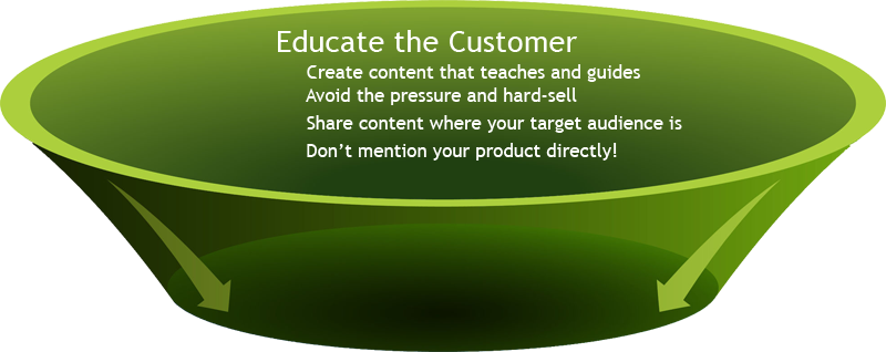
funnel-1
Take a step back and look at ways to educate, rather than persuade the customer. At this point in the funnel, they’re not looking seriously at solutions. They’re involved in the discovery process – learning what’s out there and what options they have available. You need to prove you’re even worth listening to by illustrating your expertise in a way that’s helpful and knowledgeable, not pushy.
This means filling the top of the funnel with bite-sized, visually scan-able tidbits of content in the medium and format your users prefer. And don’t just wait for the prospect to be the first to act – make sure that your content is hosted anywhere they might go as part of their research and discovery track, whether that’s video, infographics, podcasts or slide shows. They shouldn’t have to go to your site in order to learn more.
Here again, the information you send them shouldn’t be talking about your company directly at all, but rather acting as a guide to help them solve whatever issue or question they have. Going back to my previous example about cloud-based hosting, I may want to know about things like:
  • Which apps/services are supported?
  • What type of platform is best for my needs?
  • What are SaaS, IaaS and PaaS?
  • How close is the server to my location?
  • What options do I have for databases and storage?
  • How much of the server can I control or access myself?
And so on. Even at this “Awareness/Interest stage of the funnel, it’s best to educate and guide rather than push for a sale. Once the interest is piqued, the question then becomes, how can you carry over more of your prospects to the next level of the funnel?
In short, how do you tie this education and guidance to your brand without pushing the consumer away?

Going from Prospect to Purchase

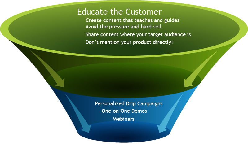
funnel-2
This is the point at which many marketers jump ravenously on the sale, but too often, the pressure is too much, too soon. Remember, they’re considering your offer among many likely competitors so how you differentiate yourself (in a way that’s meaningful to the consumer) is what’s going to warrant them giving you even more serious consideration.
This is where you put your email marketing muscle into action – reach out and learn what your prospect’s biggest concerns are. What do they specifically have questions about? Then set your content and marketing teams about forging relevant, personalized drip campaigns that answer those questions in such a way as to position your product heads and shoulders above the rest.
Common techniques that work best at this time are things like feature lists, comparison charts and pricing breakdowns. Once the consumer sees exactly what they’ll get, what it costs and what it includes, it’s time for the sales team to make their move and reach out to the customer to start planting those “loyalty seeds”.
Things like a free, one-on-one demonstration of the product, a fully featured trial account and tutorials can go a long way in showing the customer that you’ve got their best interests at heart. If you’ve got new features lined up for release, invite them to be one of the first to see how these new updates will benefit their business and how to use them effectively!

Follow Up After the Sale

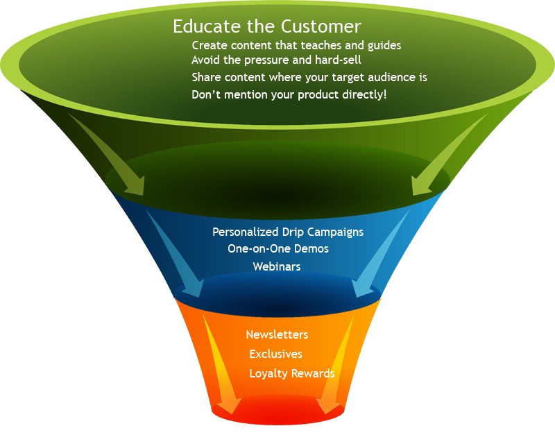
funnel-3
After the sale may feel like the time to celebrate – but resting on your laurels at this point just makes it easier for competitors to swoop in and convince your newly hard-earned customer that your product or service isn’t the best choice for them. This is why every customer should be looked at more as an ally rather than another notch on your sales belt.
Always be looking for ways where you can create the kind of experience that the customer just can’t help but talk about. It sounds cliché to talk about delivering a phenomenal customer experience, but doing so at every stage of the process – from the website to the technical support to the newsletter and every outreach avenue and touch-point in between is what creates unbreakable loyalty.
Here, things like reward/referral programs, loyalty exclusives, how-to newsletters, social media coupons and other incentives can solidify that loyalty. Don’t just throw sale after sale notification at them – make them an integral part of your brand, and your brand a part of their lifestyle. It doesn’t matter if you’re selling shoes or scalable hosting.
Always be looking for ways to add value – not what you think is valuable, but what the customer finds valuable. Every marketing initiative at each stage in the funnel should continually ask “what can we do to make this even better?”
By asking the right kinds of questions at the right points throughout the sale funnel process, you’ll not only win over more prospects, but you’ll be creating an iron-clad foundation of loyalty and communication that people (even your competition!) can’t help but admire and try to duplicate. Always look for ways to refine your funnel at any point where you find “leaks”. Seek out disconnects where the message doesn’t match the intent or where the content isn’t meeting the reader’s needs. An engaging sales funnel isn’t made of stone: it’s a fluid, ever-changing and adapting product that demonstrates precisely how you put customers first.
Have you created some unique, engaging or compelling content for your sales funnel that customers just can’t stop talking about? Tell us more about it in the comments below!
To view the original article Click Here