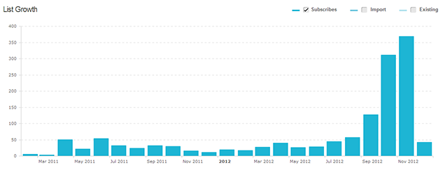
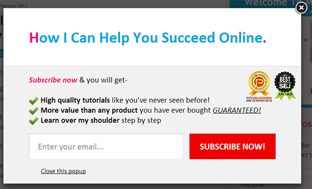
Showing posts with label Opt in. Show all posts

Tuesday, 23 September 2014

5 Shortcuts for Increasing Email Conversion Rate in Record Time

Do you know that building an email list is an important step towards your success?
But you don’t have enough time to put everything together, do you?
If that’s you, then I have some tips that will help.
These tips helped me increase my email conversion rate and I am positive that they will also help you.
First, what I learned recently about managing my time and getting things done is the importance of planning my activities.
You may be planning your activities, but just like me, you’re probably not always sticking with the plan.
So my advice, before getting started, is to block time on your calendar for each of these activities. Now, let’s see what you can do to increase your email conversion rates.

1. Offer an Incentive to Signup

Most of us are adding a signup form in the sidebar and ask people to subscribe for updates, but is that good enough?
I’ve compared my newly launched website – WP Backpack with this one and I’ve come to the conclusion that “subscribe for updates” it’s not a good enough incentive for people to signup.
Even if the launch article got some really good traffic from my existing list and social media, my signup rate was really low.
Why?
Because it doesn’t have a good incentive to convince people to signup.
On the other hand, on EugenOprea.com, you get my Free Google Analytics course when you signup for updates.
This has been working really well for me, so I keep sending traffic to this landing page.
That is why the next action point on my to do list for WP Backpack is to add a small course for my subscribers.
I am also more inclined to create a course, and deliver it though an auto-responder, than to write an eBook.
This is more effective because, with an eBook, people will get it and unsubscribe or even worse, get it and forget about it.
But with a course, readers will have a consistent reminder of you, and they will become used to clicking the links in your emails and coming to your site. Doing this will, hopefully, help them take action and follow the advice from your course.
A course will also be easier to get done.
With an eBook you will need to write and design it before being able to offer it to your subscribers, but with a course, you can build one lesson at a time.
One lesson per week is a really good starting point and you can also setup your auto-responder to deliver your lessons every week.
So don’t make your job harder by trying to finish it in one go.
Instead, block time each week to write a new lesson and send it to your subscribers once it’s ready.
Shortcut: Start an auto-responder and offer a free course for your subscribers or offer a freebie to incentivize visitors to signup for your newsletter.

2. Place your Signup Forms Strategically

This year I redesigned EugenOpea.com after 6 month of research.
I’ve put into the new design everything that I learned about increasing visitor loyalty and conversion rates.
And one of the things I’ve been focusing is the signup form, or better signup forms.
If you browse the website you will notice that I placed them in strategic locations:
  • on the home page
  • in the sidebar
  • in the footer
  • on the landing page for my course
  • in an Email Cloud Box
Now, let me tell you a bit about each of them and why you should use them, too.
On the Home Page
For most of us, the home page is the most visited page on the website, so it’s really important to make a good impression for new visitors.
That is why I’ve chosen to first share some content with them, so they can see that I am knowledgeable and genuinely provide value.
Only after that I add the signup box, with the benefits of signing up, and a link to the landing page of my Google Analytics course, which contains more details about it.
So my advice for you is to first show your visitor valuable content and then present a reason to signup.
In the Sidebar
Every site has a signup box in the sidebar and you can, just as I did, add it to make it easier for people to signup.
But make sure that you also include a strong incentive for your visitors to take action.
In the footer
I am one of those people who, when I research something, I check every pixel of that website.
For this reason I decided to add a signup form in the footer, so those like me, who reach the end of the page, get a reminder that I want to share more content with them.
On the landing page
Landing pages are a great way to convert visitors into subscribers and this is the main reason why I’ve built a page specifically for my course.
I would recommend you to do the same and if you have more benefits for your readers, create a landing page where you can tell them more about those benefits.
You can use Premise to build really good looking landing pages, so you don’t have any excuse to not do it.
In a Email Cloud Box
Now, you’ve gotten to the most interesting part.
After doing some tests and checking heatmaps for my website with CrazyEgg, I’ve come to the conclusion that my visitors’ attention is not on the signup box from the sidebar.
Visitors are immediately scrolling to the next screen once they get on a page/article.
This is the reason why I added, what I call a Email Cloud Box, which moves with the visitor as she scrolls down.
I will show how to add it in a future article.
Additionally, you should also add a signup box below your posts, so once a visitor reads one of your articles, they can choose to signup for your newsletter.
But, please be aware that not every box works for everyone and if you add signup boxes all over your site, they will not be effective anymore.
If you would like to get started faster with creating signup boxes, have a look at Elevatr, my premium WordPress plugin. It can help you easily create signup forms and webinar landing pages so that you can increase leads through email marketing and webinars.
Shortcut: Take your time to think where you should add your signup boxes, do some tests and implement them. And definitely useElevatr for your forms.

3. Ask for the Signup

A lot of people don’t know or try this, but asking for the signup has so much power.
When you close an article, when you share it on social media or when you talk about your website, ask people to signup for your newsletter.
Do it in a nice manner and also tell them the advantages. Tell them what’s in it for them.
More than this, ask them to share your newsletter with their friends and colleagues, or with their audience if they have an established business.
You will be amazed how many people will come to help you if you ask them.
But, you will have to also return them the favor.
And be genuine about it. This is very important.
Shortcut: Here’s what you should do right now: go in your favorite Facebook group, favorite forum and on the social media outlet where you have the most followers, and ask people to signup for your newsletter.

4. Start Guest Posting

Everyone sees this as a really hard task to do, but as long as you master your topic and put everything you know in writing the article, you can’t fail.
Yes, it can take months until it gets published and you may work hours to write it, but it’s worth it.
I got my first 1,000 subscribers from 3 guest posts I did at the beginning of the year and guest posting is always on my to do list.
You know that you can’t always increase conversion rates without increasing traffic, so guest posting, just like SEO, can help you drive more traffic to your website and gain more subscribers.
But here’ what I would recommend you to do to make sure you have success:
  • brainstorm 3-5 post ideas and choose a website were you want to submit your post
  • contact the website owner and present your ideas
  • if one of them gets approved, start writing it
  • send the traffic to a landing page that has a signup form and an incentive to signup
Additionally, when writing the article, make sure that you include your best tips, but think that you are writing it for your own blog.
Don’t get hung up in making it perfect, because there is no such thing as perfect.
Shortcut: Block some time and start brainstorming ideas for yourguest post. Then send your pitch and once it gets approved, write the articles. Most of the time, it is as simple as that.

5. Improve your SEO

Just like guest posting, you may think that SEO is fairly difficult, but it’s not.
All you have to do is build awesome content that people love and share.
Essentially, you will need to make sure that you write for people and not search engines.
I am saying this because search engines try to emulate human behavior when deciding what website is best for their search results.
So, put your best into writing great content and a really good headlines.
Then you can add a good description for your article to show in the search results page, get some links from friends and through guest posting and write more good content. :)
Plus, for additional peace of mind, I would strongly recommend you use Scribe, which is a fantastic piece of software that can help you better optimize your content.

To view the original article Click Here

Tuesday, 2 September 2014

How to Generate More Leads to Your Site with Opt-In Pop-Ups

I happened to see the following comment on a case study on how pop-ups impact conversion.
popup comment
These comments may indicate that everyone hates opt-in pop-ups. In fact,you may hate pop-ups.
But well-regarded marketers (Neil Patel is one) have indicated they get good results using them.
So we have to ask: Is there any substance to all the negativity surrounding pop-ups? Do they really do more harm than good?
Let’s find out.
The dissatisfaction with pop-ups may be due to them being shoved into reader’s faces every time they visit your site. Yet there are settings that can restrict pop-ups from being so annoying. For instance, popping up just once to a visitor using cookies or even after a set period of days.
It’s the ignorance and lack of effort in taking advantage of these options that cause all the complaints.
While it’s true that some readers find them annoying, the benefits gained by employing them far outweigh the losses. Indeed, after reading this post you may kick yourself for not using them earlier on your site.
neil popup - placeitSource: Placeit.net

Comparison between opt-ins achieved with Sidebar and Pop-ups

Pop-ups drive 1375% more subscribers

Nikki McGonigal, a food craft blogger, started testing out with both sidebar and light-box forms for opt-ins. After 8 months, when she compared the results, she found that the light-box form drove over 7,000 additional subscribers.
The sidebar form had a subscription rate of .4% while the light-box form converted at 5.5%.
That is 1,375% more subscribers.
The light-box form used was one present by default on AWeber.
light-box pop-up
Of course you can use Aweber’s built-in light-box utility, but to be honest, it looks kind of dumb.

 Pop-ups brought Darren Rowse 400 new subscribers per day

Back in 2008, Darren Rowse’s photography blog was averaging 40 subscribers a day. He decided to test the AWeber light-box pop-up on his site. He feared that things as intrusive as a pop-up would alienate his visitors.
What happened was quite the opposite.
Pages viewed per visitor were up and bounce rates remained almost the same.

pop-up affect on bounce rates
The site was now amassing 400 new subscribers per day.

Other opt-in case studies

Opt-in pop-ups result in 1,000% increase in conversions

Ask-Leo.com drove just 10 to 15 subscribers despite getting 44,000 unique visitors every day.
Site owner Leo decided to set-up a hover box to show up at a delay of 75 seconds, 60 seconds, 45 seconds, etc.
After all the split tests, he found the hover box set at a delay of 60 seconds was capturing the most emails.
He was now getting 100 to 150 subscribers on a daily basis.

Recipe website gets 10x lift in Conversions

Mama’s Lebanese kitchen, a recipe blog, began implementing opt-in pop-ups back in September 2012. By the end of October, they had gone from 1 subscriber a day to 10 subscribers per day.
They used Hybrid Connect for this, and with a few more split-tests, the conversions went even higher.

10x growth with pop-ups

Jeremy Shoemaker gets more subscribers from existing traffic

Conversion Voodoo was able to carry out some tests over at the ShoeMoney blog. They discovered that the inline forms disappeared when the user tried to type in the email. Just by dimming the inline field and keeping the words “Enter your email” slightly visible improved the conversions by 36%.

simple changes more conversions

What are the different kinds of pop-ups and how do they affect conversions?

Simple opt-in pop-ups

The simple opt-in pops are ones without many bells and whistles. These pop-ups spell out the benefits of subscribing to the blog. Since, it doesn’t offer anything in exchange, only people who are really interested in what you’re sharing would sign up.
If you’d like a very loyal list of subscribers, you should go for simple opt-in pop-ups. You can see an example below.

Opt-in pop-ups with offers

A free gift like an eBook increases the opt-in rates dramatically. Although it does come at the cost of getting freebie seekers, if you want to grow your email list quickly it’s a good option.
This simple pop-up, which doesn’t even directly ask for emails, is the third biggest lead generator on Usertesting.com.
offer to readers
And Health Ambition, a site in the food and health niche, got a nice .4% bump in conversions when they offered a free report in exchange for reader email.
bribed optin
However, they had some extremely popular blog posts on the topic of juicing. They decided to offer new subscribers a custom juicing related eBook and the opt-in rate jumped to 3.2%. That’s nearly a 3% increase.

Scrolling-trigged Pop-ups

The scrolling-trigged pop-up is something that I regularly see at ConversionXL. You start reading the post, reach to the end of it and then there’s a pop-up. The trigger time can be adjusted depending on where you want the pop-up to display based on the percentage of text read.
It’s a great way to get subscribers. People are already interested in the article and may like to get more.

pop-ups triggered with scroll

Pop-ups with exit-intent technology

Though the term sounds fancy, the technology behind it is really simple. The plugin tracks users’ mouse movements to get a sense of when they’re about to leave.
How it does this really easy. If the visitor’s mouse leaves the page area to go to either the close button or back button it triggers the plugin.
Neil Patel tested pop-ups with exit-intent technology for his site NeilPatel.com. He was able to increase conversions by 46%.
You can see similar exit intent pop-ups on Quick Sprout too. I was just using the free tool over at QuickSprout.

exit offer
The pop-up is powered by Bounce Exchange. It does however cost a hearty $3995 per month for the starter package itself.
Another example is Xero Shoes, who presents visitors with a free research report when they are about to leave the site. This report on the benefits of going barefoot raised opt-ins by 2.5% and sales by 28.4%.

last minute offer
Syed Balkhi of WP-Beginner saw a 600% lift in email opt-ins when he used Optin Monster’s pop-ups powered with exit intent technology.
Optin Monster tripled the conversion rates. The bounce rate didn’t go up either.
Optin Monster with exit intent technology would cost you $199. It’s much cheaper than Bounce Exchange. However, an even cheaper option is Holdonstranger. You can even see a live demo of your own site (or any site for that matter).
I just keyed in mine and pretended to leave the site. BAM we have the pop-up. It costs $97 a year, which works out to $8 per month.

exit intent technology

The Arrogant Pop-up

See how Kissmetrics employs the arrogant pop-up.
Pop-ups with words like “No thanks,” or “I am happy with low traffic” are never supposed to work if you go by common sense.
But according to data from ConversionXL, these very opt-in boxes outperformed others by 34%.
pop-ups work

A little nudge

It’s not an opt-in pop-up in the strictest sense. However it’s similar to scrolling-triggered opt-in pop-ups. Back in September 2011, the guys running the Univeristy of Alberta website found that they were getting lots of visitors from organic search.
They wanted to see if anything could be done to make them subscribe. All they did was use Qualroo and casually mention that they noticed the visitor loved news.
It worked.
See what happened during the next 9 months.
survey-results (1)
Granted, three times the visitors weren’t interested in subscribing, but 21% might never have signed up without this extra nudge.
A small increase in conversions is always better than none. I’m sure if they had used some of the more aggressive options mentioned above, the success rates would have been higher.

Does the timing of pop-ups impact conversions?

Let’s talk about how the pop-up timing affects conversions. Studies have shown if pop-ups are displayed after 5 seconds, the sign-ups are the highest.
Thinking about it, if you slap a pop-up right off the bat, it may annoy people even more. Five seconds seems to be the sweet spot between giving enough time for getting a feel for the site and not appearing too aggressive.
However, does waiting a little longer decrease the conversions?
In another experiment, opt-ins peaked at 10 seconds and were comparatively poor at the 5-second mark.
peak at 10 seconds
It seems that the best timing and conversion rates vary from one site to another. You need to test it out for yourself.
Now for a look at bounce rates. All the case studies above show that pop-ups have no impact on the bounce rates. But is it true throughout?
Let’s see.
Do pop-ups negatively affect the engagement metrics?
I searched long and hard to find something that shows if pop-ups can have a negative impact on opt-ins or engagement metrics.
It seems it does.
We have one case study that shows pop-ups increasing the bounce rate.
Matthew Woodward ran the tests for time periods of 50 days each. The former 50-day period featured no pop-up and the later period featured a pop-up.
He used a 7-second delay to display them. While the conversion soared to 40%, the bounce rate increased by 9.02%, the average visitor duration declined by 10% and pages per visit too decreased by 9%.
bounce rate increase

The bounce rate for the returning visitors or the regular readers didn’t increase much.
However compared to the opt-in forms displayed at the end of the post, in the sidebar, or on the About Us page, the pop-up was the one most successful in converting visitors.
I reached out to Matthew to see if the statistics were unchanged even now, and he confirmed that they are.
I feel that there are a couple of things that can help boost engagement metrics.
The 7-second delay may be too soon for the readers. The timing is a good thing to test.
Mobile visitors were spared the pop-up. However I’d encourage displaying pop-ups to them since the plugin used is mobile compatible. Also, even if it’s unrelated research, if mobile visitors can fill in surveys they might as well key in their email ids too.
The table shows survey responses and a large percentage came from smartphones and tablets, so it’s clear they will respond.

response of survey takers on mobile
The third possibility is that the lack of an opt-in bribe. Readers are less reluctant to give away their email ids for nothing, so much so that they’d rather close the page.

Share your thoughts!

Do you hate pop-ups?
Even if you hate them, please let us know why you think that they won’t work for you.
Have you tested out pop-ups and found that they lower engagement and decrease overall conversions?
To view the original article Click Here