Dropbox was an incredibly novel idea — back in 2009. The concept of the cloud hadn’t quite broken into public consciousness yet and smartphones hadn’t reached its omnipresence. Explaining Dropbox to someone on the street in 2009 would’ve been met with confusion, misunderstanding, or disregard.
So Dropbox took a chance.
Rather than add lengthy explainers or detailed product descriptions to their marketing site, they changed the game for marketing consumer products on the web. Dropbox partnered with video studio Common Craft to make a 2-minute explainer video that cost them $50,000. They wiped the homepage slate clean to show only the explainer video and a download button.
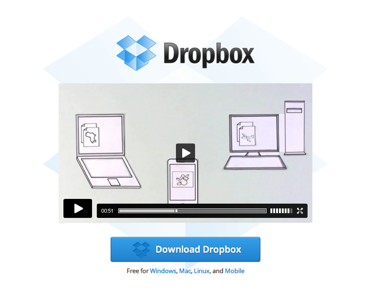
Upon putting up the video, Dropbox’s conversion rate jumped up by 10%, resulting in 5 million new customers and $24 million in revenue. With over 25 million views today, the video played a huge role in getting Dropbox to 100 million users by 2012, with $0 advertising spend.
Video is one of the most effective ways to engage people — and not just as a way to drive product signups. Combine video with email, and you have a powerful engagement system on your hands, especially for user onboarding to educate, engage, and ultimately win happy customers.
Let’s dig into 3 reasons why video works so well in emails and the tactics you’ll need to incorporate video into your own campaigns.
1. Improve Clickthrough Rates on Onboarding Emails
The period right after signup is one of the best windows for people’s attention. For example, welcome emails have 4x the open rate of most other types of emails.
But of course, solid open rates aren’t everything. If your clickthrough and goal conversion rates remain low, it’s possible that your email content isn’t engaging enough. So how are you going to nudge people to take key actions, like installing an extension or trying out that top feature? Isn’t that a waste of an open?
Video hosting company Wistia wanted to see what video could do to boost engagement in their emails. So they ran a split test “using two identical emails with identical content, except one had a video as the top piece of content and the other had an illustrated graphic.” The clickthrough rate (CTR) for the email with video was 38% versus 12% for the one without video. That’s a win for video by over 3x.
The effective use of video in your onboarding emails can result in more clicks, engagement, and a quicker path to people’s aha moment.
Set Up the Video CTA
What might be confusing when talking about using video in emails is that we don’t recommend that you embed the video itself in the email. The reason is simple: it probably won’t work for your recipients. Apple Mail is just about the only email client that reliably supports embedded video.
What we do recommend is using a screenshot or video thumbnail image with a play button and linking that to the page with your video. The play button becomes your call-to-action (CTA) to grab people’s attention — and will often be more effective than a text link or image alone. It’s what the experts over at Wistia do, themselves. As Director of Marketing Ezra Fishman concludes: “Simply put, a thumbnail image with a link to our site will be more effective for our marketing efforts in almost every instance.”
Here at Customer.io, we’ve seen how including a video CTA in your onboarding email can drive more engagement. Of our post-welcome onboarding emails, our sole email with a video has a 4.1% CTR, compared to an average of 2.2% CTR for the other onboarding emails without video.
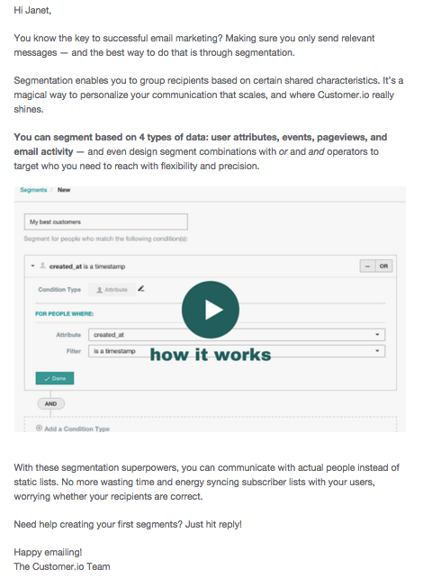
Notice how much the video CTA sticks out in the email, compared with the other elements designed to grab your attention, like links and bolded text. It occupies a ton of space, the thumbnail illustrates all those words about how segmenting works in the tool, and the play button tells you to click through.
2. The Shortcut to Understanding
If an image is worth a 1,000 words, a 1-minute video is worth 1.8 million. If you’re trying to explain how to use a particular feature or the moving mission behind a product, videos can serve as the quickest medium for your message to hit home.
When sales intelligence platform Implisit analyzed 250,000 sales emails, they found that emails with fewer than 100 words at the beginning of a series generally outperformed longer emails. Short emails got the highest response rates and drove the most sales.
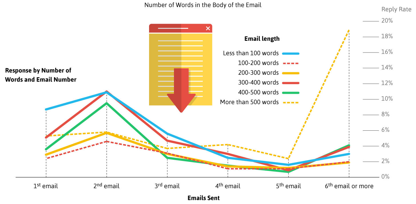
source: Implisit infographic
Your onboarding emails and traditional sales emails, while different, are both building trust and new relationships. Video contributes to those connections by getting your point across in a more enjoyable and thorough way.
Screencasts, not how-to’s
StatusPage.io — an easy way to communicate your server status — uses video in their onboarding emails to explain key features like Third-Party Components. (Every app today is built on top of dozens of third-party services, like Amazon AWS for web hosting. The Third-Party Components feature connects with those services so that their statuses display directly on your status page.)
In written form, the multi-step process of setting up Third-Party Components takes nearly 500 words, 6 screenshots, and some scrolling — which works well as a help doc. But sending help documentation copy in your email isn’t exactly the best engagement tactic.
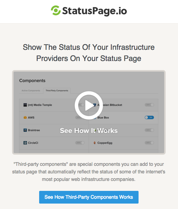
Instead, StatusPage.io features a digestible 2-minute screencast in their onboarding email. The kicker here is the design of the user experience, from email to video to app. When you click through from the email, the video autoplays in a modal. When the video is done playing, you’re on the exact page you need to be to start setting up a third-party component. (Here’s another reason why embedding within in email isn’t all it’s cracked up to be.)
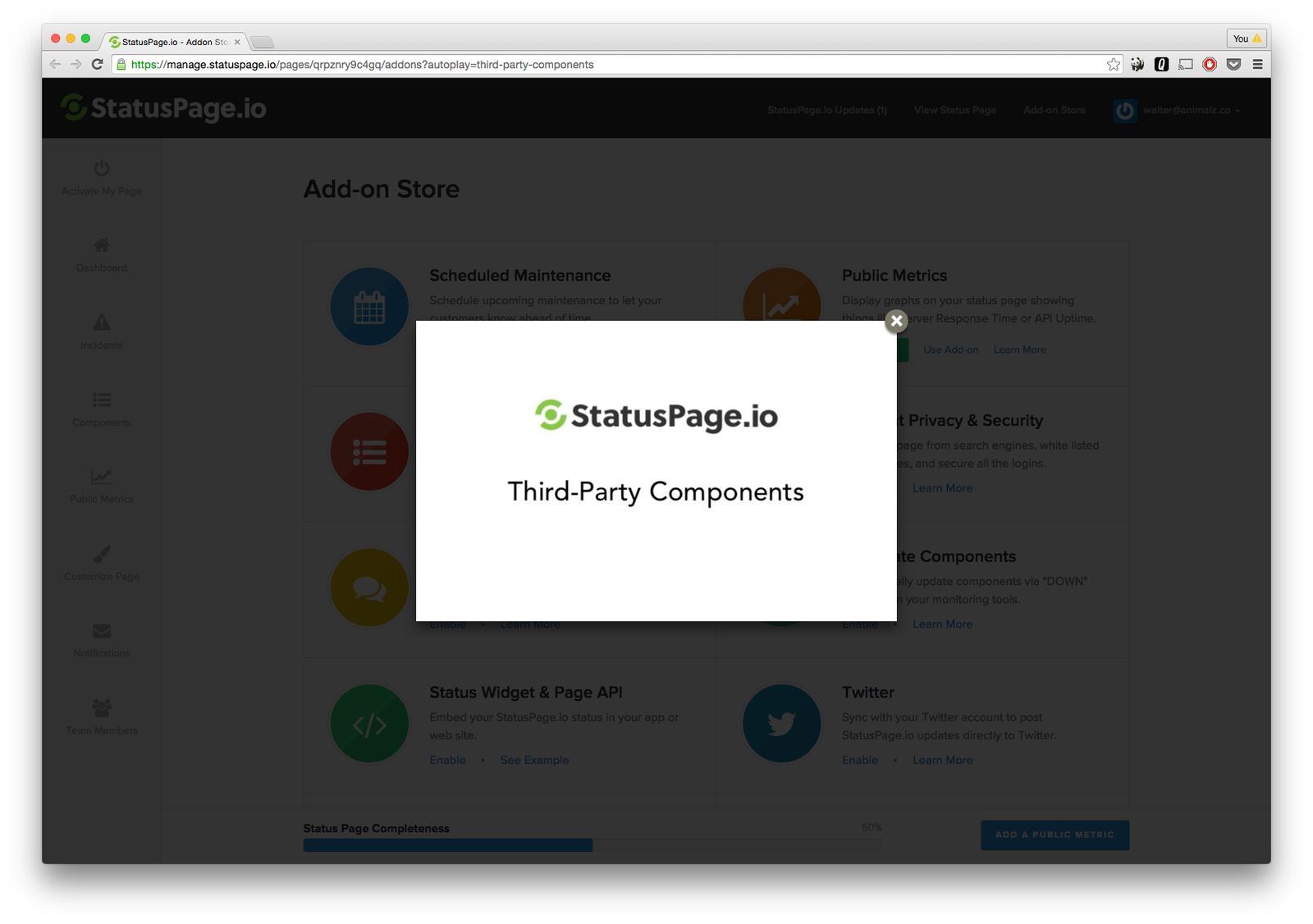
Altogether, that experience is a powerful way to explain a key feature and then nudge people toward taking immediate action on what they’ve just learned.
Showing, not telling
Timeshel is an iPhone app for making prints of your photos every month. Soon after you download the app, they send an email with a video showing you how Timeshel works and how these monthly prints makes life better.
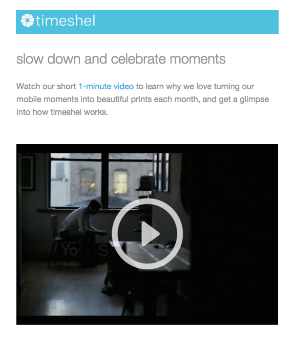
Timeshel’s use of video here, much like Dropbox’s explainer video, compacts information that could take up multiple pages of a marketing site. It weaves story, mission, and product together in one minute. Not only do we get a better sense of the why — it’s not just about pretty pictures but a deeper enjoyment of moments and memories — we get to see people using the app and interacting with those tangible photos.
3. Connect on an Emotional Level
If you’re only measuring the success of your email campaigns on a metric-per-email basis — open rates, clickthroughs, even conversion rates — your thinking is stuck in the short-term. The onboarding period especially is an opportunity to establish an emotional connection and make a lasting impression.
To Wistia co-founder/CEO Chris Savage, video is the best way on the web to do just that. Chris calls this “scaling feelings.“ He explains:
Video is a great way to save time, but beyond that, it’s the best way to scale emotions and human connection … and it will sway your audience over to a different way of thinking.
Show Humans in Video Thumbnails
Featuring real people in the video thumbnail is a powerful way to make a human connection. We’re naturally compelled by faces. (There’s even a specific part of the brain that only responds to faces, called the fusiform gyrus!)
This is an effect that Wistia uses to its advantage in its own onboarding emails.
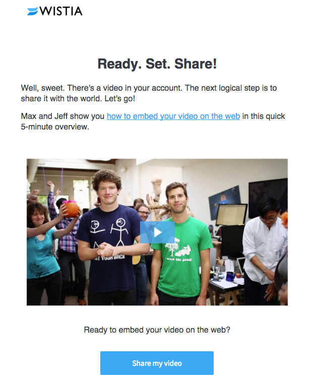
The goal: get people to embed their first video on the web. The thumbnail: friendly-looking faces … amidst an office dance party.
When you click to watch the video, you’re rewarded with a reminder that embeds drive more views to your videos and some fun. Watching Jeff, Max, and co. is way more compelling (and delightful) than reading step-by-step directions or faceless copy.
How to Get Started with Video in Your Onboarding Emails
Before we go, here are 3 more quick tips to take away.
1. Show people there’s a video.
Merely telling people that there’s a video with a link fails to unlock all the power we’ve discussed above. Here’s an example of what I see fairly often:
Merely telling people that there’s a video with a link fails to unlock all the power we’ve discussed above. Here’s an example of what I see fairly often:

Instead, follow Wistia’s best practices:
- Let people know there’s a video (subject line, email text, play button on a thumbnail).
- Choose an enticing thumbnail from your video to include in your email (hint: friendly faces attract clicks).
- Link that thumbnail to a page on your website.
- Keep the number of calls-to-action limited.
2. Use a GIF!
GIFs are a great way to introduce moving elements into your email and capture some of the benefits of video — like demonstrating something in an app or showing humans in motion.
GIFs are a great way to introduce moving elements into your email and capture some of the benefits of video — like demonstrating something in an app or showing humans in motion.
Here’s an example from CloudApp that shows right in the email how super simple it is to use:
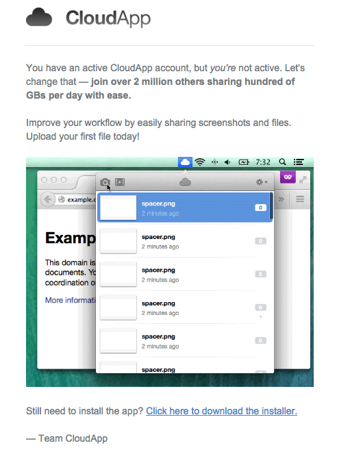
click to see the gif in action
And one from Segment.com that makes a happy human connection with the Segment team, as part of getting you all set up:

click to see the gif in action
As long as the GIF is set to loop (in the file itself), it will keep looping in any email client that supports it. Some email clients will only show the first frame. For more information, check out Litmus’s helpful guide to using GIFs in email.
3. Put Your Goal First
As awesome as videos (and gifs) are — they should be serving the goal of your email. Don’t include a video just for the sake of adding a video. And if people are clicking through to the video, they’ll likely miss any other calls to action in the email. Putting a video into an account verification email, for instance, ends up being counterproductive.
As awesome as videos (and gifs) are — they should be serving the goal of your email. Don’t include a video just for the sake of adding a video. And if people are clicking through to the video, they’ll likely miss any other calls to action in the email. Putting a video into an account verification email, for instance, ends up being counterproductive.
Video Resources
Now if you’re up for jazzing up your emails with video, here are some resources to get you going:
Screencasting tools:
- ScreenFlow (Mac $99)
- Camtasia (Windows $299, Mac $99)
Editing tools:
- iMovie (Mac free)
- Windows Movie Maker (Windows free)
Publishing, hosting and embedding tools:
Shooting video:
Video thumbnails:
Have you tried using video in your onboarding emails? What worked and what didn’t? Share your story or thoughts in the comments!
To view the original article Click Here

No comments:
Post a Comment