Another likely contributor to this problem is a lack of understanding (on the part of content producers) about how our brains process information.
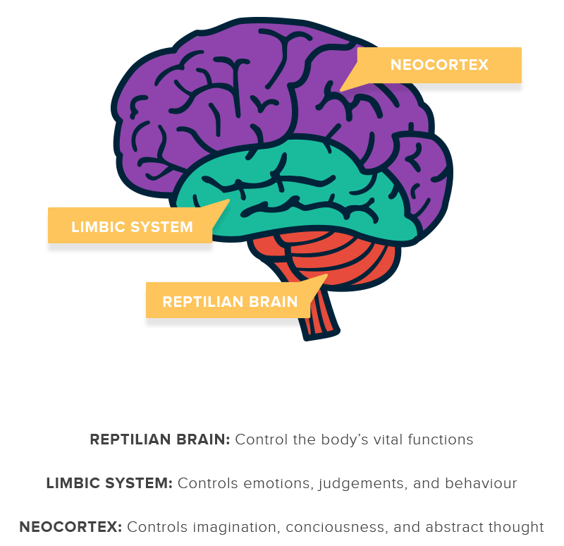
I’ve always been fascinated with neuroscience, and decades of research have led to a stronger understanding of how our brains have evolved to do things efficiently. When we encounter new information, the primitive parts (the reptilian or “crocodile” brain and the limbic brain) kick in first to answer questions like, “Can I eat this?” and, “Is this a threat to my survival?” If the answer isn’t that simple, the primitive brain will decide whether to kick the new information up to the neocortex, which handles such processes as human language and abstract thought.

That’s where visuals in your content come into play. You can’t go right for the neocortex and expect good results; you have to catch the attention of the primitive brain first.
Seeing Is Believing
Imagine you’re searching the web, and you come across a page with giant blocks of text and no images. Within nanoseconds, your crocodile brain says, “Whoa, this is going to be a painful read.” It then shuts down the desire to read the page because there’s nothing there that commands your immediate attention.
Now, if that same page has a picture of a delicious chocolate cake or a group of attractive people, your primitive brain perks up to see what’s going on. Images like these speak to primal desires. To grab the most attention for your content, start by stimulating the primitive parts of the brain.
One of my favorite books on this subject, Neuro Web Design by Susan Weinschenk, details the story of a kitchen remodeling company trying to make a good ad. The company had no shortage of great photos to showcase the amazing work it had done in the past, but the ads still weren’t succeeding like company leaders wanted.
With the help of Weinschenk’s research, the company decided to stage one of its kitchen photos in an environment that included a young, attractive couple in bathrobes cooking up a post-sex snack together. The ad became an instant success. The attractive couple grabbed the attention of the primitive brain, and the entire visual moved viewers to desire that kitchen experience.
Think of your target audience’s neocortices as a club and their primitive brains as the bouncers. Visuals are your VIP pass4. (highlight to tweet) Without good visuals, you’ll usually find yourself on the outside looking in.
Incorporating Visuals Into Content
Of course, you can’t just slap any visual into your content and expect results. You want visual content to support the text and vice versa. Try these strategies to make sure you’re using visual aids to their fullest potential.
Stay Relevant
Don’t just put a picture of a juicy hamburger on the page if you want to promote a new concrete mixer. Spend some time thinking about how to express your main points with an engaging graphic. Research the successful posts on both your topic and your intended site for posting, and take your cues from what you see presented there.
Keep It Simple
Once you think about what kind of images you want for your piece, consider ways to make them appeal to the primitive brain. Could you show a group of attractive people in this setting? Think about how to make your audience associate with your visuals in a visceral yet positive way1.
Get a Professional
Once you have your idea in place, hire someone who has the skills necessary to provide a quality product. Get a graphic designer or other professional who is well-versed in the concepts of neuromarketing and visual storytelling.
Coordinate and Collaborate
To get all of your content working together, you need your people working together. Encourage your writers and visual artists to collaborate throughout the process instead of letting them work separately until the end.
Fit the Medium
A blog may not need more than a couple of pictures, while a professional presentation requires clean-looking charts and graphics. Choose visuals appropriate to the setting in which you want to present them. Those crisp, mathematical charts may win over investors, but on most general-interest blogs, they’ll just look like more noise for your audience’s crocodile brains to ignore.
Don’t Overload
A few visuals bring attention to your content, but too many visuals make it hard to digest. Even worse, if you go overboard on images, people might have trouble loading the page and close the tab before they ever read what you have to say.
Remember: Your visuals should simultaneously grab your readers’ attention and further the story you want to tell. Appeal to the crocodile brain with catchy images, then hold the attention of the neocortex by providing quality content. If you can do that, your content will finally get the attention it deserves.
To view the original article Click Here

No comments:
Post a Comment