One of the biggest new trends in search advertising is the entry of mobile devices. Today, it’s indicated that over 50% of all searches on Google come from a mobile device. Google recently rolled out a modification to their algorithm that affected how well websites rank in the organic results depending on its mobile usability.
Google says following the announcement of the new ranking factor for mobile websites, they saw an increase of 4.7% in the amount of mobile friendly websites in March and April of 2015.
Obviously, mobile is a huge area of focus.
But what are you exactly supposed to do? We have all read the articles about how you should get “mobile friendly”, but what does it actually mean?
Today, I will cover some of the basics of matching your ads and landing pages with your visitors’ true motivation in order to execute “mobile friendly” Google AdWords strategies.
How to Think of Mobile Users Versus Desktop Users
Start by looking at mobile versus desktop intentions, and you find some interesting matches as well as differences.
Keep in mind the different situations users are likely to find themselves in when using either device. With desktops, you’re more likely to see people in a focused state, they can handle more information due to the bigger screen andwill generally spend more time researching.
Desktop users are less forgiving of your website’s design and content. If you have a poorly designed website in 2015, you are very likely to force people to find another potential vendor. It’s simply too easy to click on the back button and find an array of other options.
Mobile is a different ballgame as the conversion rates and behavior from users is so different from industry to industry.
Where the conversion rates for e-commerce stores tend to be lower on mobile, and then we see astronomical conversion rates for local lead gen businesses. A study has shown that over 50% of mobile searches result in local visits in a store. That’s an impressive amount and the opposite of what you see with e-commerce.
Finally, just thinking that users only stick to either device is not sufficient. Upon analyzing user behavior, you will see that they switch from device to device. A search might start on a smartphone, and then be taken to a desktop for finalizing the search, comparing with competitors and going more in-depth.
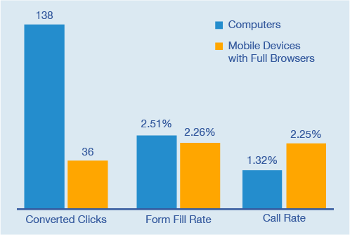
Our data in White Shark Media® shows that mobile users are far more likely to call businesses than desktop users:
How to Structure an Efficient Mobile Ad
One of the first things you have to be aware of with mobile ads is that you have less space to work with. As opposed to a desktop ad, you will only be able to show above-the-fold if you’re in the top two position.
This puts even more weight on your ads to be efficient. But, it also means if your ads are successful then you have a huge opportunity to make a lot of money.
1. Use Short Words for Mobile Ads
With both a shorter attention span and a smaller screen, capturing the attention of mobile users is a challenge. One of the longest standing best practices is to focus your ad writing on shorter words.
Ignore the urge to articulate yourself in extraordinary lengthy words extending the knowledge of your immense vocabulary. Be precise. Get your point across. Highlight your USPs in short terms.
This also holds true for regular description lines in AdWords ads but is even more important to remember for mobile AdWords ads.
2. Consider Environmental Changes from Desktop to Mobile
For some industries, the impact of changing from desktop to mobile isn’t one a big deal. However, there are important factors to take into account for others.
For a consumer researching the next desktop she is going to buy, you won’t need to change your ad copy much from desktop to mobile. You can test different messages of course (as always), but it’s not a fundamental change to the way you have to write your ads.
Now imagine a consumer searching for emergency plumber on her smartphone at 10 pm at night. Do you think the environment has changed? Does the situation now merit a completely different ad than if the user was searching on their desktop at 4 pm on a Saturday? Of course it does.
A great ad to present in such a case would be:
Emergency Plumber 24/7
Ready by the phone. Call now!
1-hour guaranteed response time.
Ready by the phone. Call now!
1-hour guaranteed response time.
Writing ads that are intended to fit exactly the situation your prospective customer finds herself in is marketing 101. Mobile devices combined with the keywords used give you an incredible opportunity to tailor your ads for specific audiences at a high success rate.
3. Write Mobile Ads That Highlight The “Mobility” Situation
One of the longest standing best practice for mobile ads is to write an ad that touches upon any of the following statements:
- Mobile-Friendly Website
- Call Us Now
- Call us from your mobile
- Display URL with “Mobile” in it
The idea here isn’t to just say the word mobile and then expect success. The idea is that the user should know that you have put thought into your mobile ad it is not just an afterthought.
4. Include Call and Sitelinks Extensions
Ad extensions should always be included in AdWords ads, but there are starting to be so many that you need to weigh each extension and how it applies to your needs.
For mobile ads, the two best extensions are Call extension and Sitelinks extension.
Call extension is a given if your main goal with AdWords is to generate calls.
Sitelinks extension ensures that you get the most ad space possible.
How to Structure an Efficient Landing Page for Mobile Users
First of all, it’s important that your website is responsive. In 2015, it doesn’t work if you haven’t designed landing pages customized for the smaller screens.
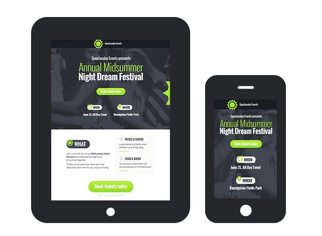
Some of the key features of a mobile landing page are these:
1. Format Your Content To Fit Smaller Screens
Your content should be written and formatted with the purpose of getting your core message across. Some websites think less is automatically more for mobile websites, but that is a misunderstanding of mobile user behavior. Mobile users are not interested in less content, they’re interesting in less clutter.
If you design a mobile website that users have to scroll endlessly to weed through the information, then you might lose them. But if you, on the other hand, create expandable elements (see below), then you can include as much information as you want. The mobile user will just expand the elements they are interested in.
The idea of creating scannable websites still apply to mobile devices – you just have to remember that the area a user can scan is much smaller on mobile devices, so your content formatting strategy should of course also be changed.
2. Don’t Try to Capture Your Prospects’ Entire Profile with Contact Forms
The contact form for your mobile landing page should only contain the crucial elements. Don’t try to get users to fill out more than four fields. If you want to see what you can get out of mobile landing pages I would even consider only asking for three things:
- Name
- Phone number
If you have a strong process for calling leads quickly, I would even consider removing the email. In any case, you should aim to reduce the amount of fields in your forms and only include the most important ones. Again, if you can, consider just asking for name and phone number. Only include email if you have trouble contacting leads immediately after they fill out your contact form.
You might also consider changing your contact forms to “click-to-call” buttons. Instead of having contact forms, then try to get the user to call you immediately. They have their mobile phone right in front of them, so getting them to dial the phone could be as easy as asking them to do it.
One big tip for getting your landing pages to convert better is to align your potential customers’ need for information before they decide to call you. Where a decision to choose a new marketing platform is not an on-the-fly decision, deciding on which airport taxi service to use is. If the website looks halfway decent, and they clicked an AdWords ad that listed a couple of your USPs, then you can easily have a click-to-call button immediately on your landing page.
Think of pop-ups. As the user, you typically dislike them, but they are one of the most efficient ways to increase the amount of email subscribers to your blog. The same applies here.
3. “Call Us Now” Buttons with Click-To-Call Functionality Spread Out Through Your Landing Page
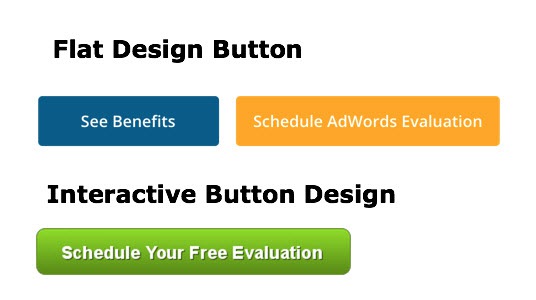
Your landing page for mobile should have strategic call us now buttons placed throughout the landing page. Preferably, these should be very easy to identify as “pushable” and the purpose of the button should be clear. Avoid creating flat-design buttons as they can look like non-interactive elements instead of the clickable element it is.
4. Video can be Effective — Just Analyze Engagement Metrics
Avoid relying on a video to relay your most important information. Most people are using their mobile device in a location where switching on sound is less than ideal. It’s fine to include a video if it sells your service well, but be careful relying on it.
Wistia, YouTube, and Vimeo all have advanced video analytics that will tell you how often your video is played and for how long. Remember to take this into account when determining whether your landing page video is helping you convert more.
Final Advice: Custom Columns Allow You To Identify Patterns
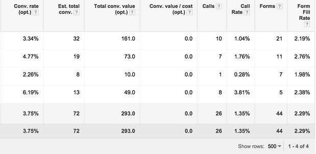
Use custom columns in Google AdWords to truly see the impact of how your desktop vs mobile design is generating calls or contact form submissions.
Custom columns are one of those things that fix a lot of the problems from the past. Using several conversion types like hard conversions (lead form completion) while also including softer touch points like whitepaper downloads was impossible just a year ago. Today, it is possible to differentiate your columns and segment your data.
You used to only have one column with all your conversion data aggregated. With the ability to segment the data, you can now include more conversion goals or segment the data that you’re already seeing – a natural area is segment calls and form fills:
Don’t Let Mobile be an Afterthought
For mobile truly to be effective it’s about time we start thinking of it as its own medium. Personally, I would have loved if Google had kept mobile more separate from the current form where mobile is a part of the regular desktop campaign. Although I can see the advantage of not having duplicate campaigns, I feel they overdid it with the current setup.
Here’s three takeaways that summarize my advice today:
- Write ads that are short, call-focused and refer to the mobile environment
- Design landing pages not with less clutter, but better organized content
- Avoid copying the same functionality from desktop landing pages like contact forms
No matter what you do, you shouldn’t let mobile be an afterthought. The most common mistake I see in Google AdWords accounts is a failure to follow through on the huge mobile marketing opportunity out there.
Don’t think of mobile search marketing as just another way to create an AdWords ad, or change a bid. Even though this has been enough until very recently, more and more advertisers will soon see the benefits of targeting mobile users efficiently.
To view the original article Click Here

No comments:
Post a Comment