

As a Facebook Marketer, there’s a lot I like about it. But then there are other things…Like the “20% rule” which limits the amount of text, you can use in images.
I’m not able to print 20% of the bad words I’ve said while trying to create Facebook Ads without using Facebook image representations, using the word “Facebook,” and making sure the text stays under that percentage.
In September, when Facebook began allowing larger sizes for images on link page posts (8X on the desktop, 4X on mobile) I was excited. Other modifications were made for sponsored story & ad images. (Check out my guide to the new sizes or the official guide).
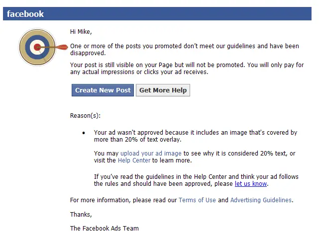 However, even with those improvements, many of my ads were still rejected as “not approved,” usually because of too many words!
After some research and trying the tool above, I learned that Facebook’s grids aren’t flexible at all.
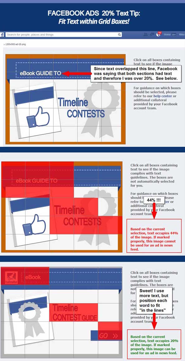
Look how “Guide to” in the title has a grid line running right through it, plus some letters in “Guide” and “ebook.”

It appeared that “Guide” was in two rows and columns, (below) which was why I was being penalized.

I learned that a grid + text = a full-text box. If there’s any kind of overlap, it still thinks the whole box is full. Test it yourself:
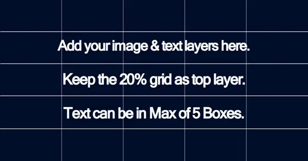
Using this info, if your text is moved a bit and doesn’t overlap any grids, you should be able to pass the approval test with flying colors, or at least keep below 20% (like in the following illustration.)

When I tried it, there was lots of loading, adjusting and repeating until everything lined up perfectly. Slow, but satisfying.
A better way is to create your own grid templates? Mine are available here. You’ll get a grid on the top layer, and then you can insert your own design elements below. Turn the grid back on to see how well things are aligned, if it hits 20% metric or there’s overlap.
Or, try to create your own grid. Choose Edit:Preferences:Grids and pick a line every 20% with one subdivision. Preview with View:Show and choose Grid, or toggle it off and on with Ctrl-Pls.

When designing elements for your boxes, you’re allowed to have text in as many as five boxes.
Here’s what you’ll get in this download: Download this Zip file
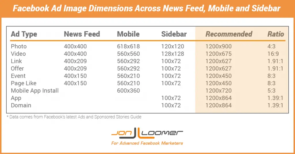
A 1200X900 page post photo ad grid .psd in the recommended size
A 1200X627 page post link ad grid .psd
A 400X209 page post link ad grid if you need a smaller size for news feeds.
A 1200X627 page post link ad grid .psd
A 400X209 page post link ad grid if you need a smaller size for news feeds.
Remember, Facebook uses a variety of sizes for the different types of link ads, including page post photo ads and page post link ads.
Don’t take my word for it, here’s the list from Facebook Ad Master Jon Loomer himself!
Hopefully, these strategies will help everyone who has been trying, and perhaps failing, to design effective Facebook Ads because of the 20 percent text rule.
It’s nice to know that you don’t have to cut out words after all (wouldn’t hurt though, in some cases!) but you can sometimes solve the problem by adjusting your words to better fit within the lines.
If you want to keep playing around, be sure to pull down these PSD files.
1.91:1 Aspect Ratio
Finally, a good rule of thumb is to keep your image width at 19.1 times its height. This makes scaling look consistent in most environments, rather than the stretched-out look.
This works for Mobile News Feeds, Sidebars, or Desktop News Feeds. Facebook has begun allowing larger sizes for link images, which means that separate ads with Photos aren’t as vital.
Infographic version:
If you have any questions or comments, let me know.
To view the original article Click Here
I was exactly finding for this information in a written and understable format. Thanks a million for it. Is it applicable for facebook ad databases?
ReplyDeleteYour blog provided us with valuable information to work with. Each & every tips of your post are awesome. Thanks a lot for sharing. Keep blogging, Rental / Lease option available
ReplyDeleteTo some people, this may seem like a non-issue, but when you have something you really want consumers to notice, you want to go BIG. With that in mind, Facebook made the right column ads bigger and bolder.
ReplyDeleteFacebook advertising Brisbane