

Do you have any idea how often the average person looks at their phone?
46 times a day.
That’s huge. Every single day the average person pulls their phone out of their pocket to check what’s going on nearly twice an hour. When you stop to think that they’re asleep for around eight of those hours, that number increases to nearly three times per hour.
Mobile devices have revolutionized the way we consume content. You don’t have to be stuck in the office or at home behind a desk to see what’s going on in the world.
You can check your team’s scores, the latest news and even purchase that new pair of shoes you want from anywhere. Be it on the bus, when you’re out for dinner or, as is likely true for most of us, in the bathroom.
But there’s a problem. Despite the increase in mobile use many marketing managers are coming up short. They’ve taken a laissez faire approach to their mobile optimization campaign and are suffering poor mobile conversion rates.
They don’t treat mobile as a demographic all it’s own. They rely on responsive design to handle their optimization and think that’s going to be enough to drive conversions.
But it’s not. Just as you tailor your messaging and pages for different traffic sources and segments, you need to optimize your site for mobile specific users.
Is Mobile Optimization Really That Big of a Deal?
You bet your ass it is.
Thanks to the proliferation of faster network browsing speeds and the development of mobile technology, there are more users than ever who turn to their mobile device for their online needs.
Mobile has slowly overtaken desktop as users’ favored platform. It has more global users, higher numbers of social shares and is used for longer periods of time than desktop overall.

So why would you rely on the bare minimum solution of responsive which does little more than resize content?
Would you take the bare minimum approach when optimizing for the traffic source that brings the most paying customers? Would you not tailor your messaging to meet the needs and expectations of you highest converting segment?
Of course you wouldn’t. You’re reading about CRO here so I can only assume you know that higher conversions lay in detailed personalization.
Mobile is no different to your segments, cohorts and traffic sources. It requires a distinct experience, one optimized for the medium and the users who favor it. If you don’t offer that experience you could see 66% of your mobile users bounce, with one third never returning.
So yeah, mobile optimization is a pretty big deal.
Fortunately there’s plenty of ways you can optimize your mobile experience. In this article I want to look at a few tweaks specifically related to the placement and optimization of your copy.
First up…
Focus on the Center of Screen
Knowing where your users focus their attention is the first step in proper message placement. Get your key message in the right spot and you’re half way to holding that oh-so-short user attention span.
Back in college I was told that user attention works from top left to bottom right. The teacher followed with the sage advice that if I wanted my message to immediately grab attention, it should be placed in the top left.
But mobile’s a different beast. The smaller screens attract and hold attention in different ways. Taking the longstanding belief and approach so popular on desktop isn’t going to work for the mobile crowd.
According to this eye tracking study from Google, mobile user attention focuses firmly on the center of the screen.
You need to re-evaluate the design of your content on mobile devices.
You’ve probably spent a long time coming up with a killer value proposition, don’t let it go to waste with incorrect placement. Ensure your key message takes center stage which, coincidentally for mobile, is the center of the screen.
What About the Fold?
“Mobile user’s scroll more so the fold isn’t important”
I’ve heard this phrase uttered hundreds of times. Each time I hear it, I die a little inside. Why? Because it’s BS, but BS founded on a truth.
The truth is mobile users are more likely to scroll. 90% of mobile users scroll within the first 14 seconds of landing on your page. Great, I’ve just disproved my own argument right?
Not quite.
Look at how people use their mobile phones. The action of scrolling takes little effort and, for most of us, has become a habitual reflex. We don’t scroll because we’re interested, we scroll because we’ve developed a habit of scrolling.
But the key to the fold’s importance is reflected in user attentions. When studying the fold and how users split their attention The Nielsen Norman Group discovered “Web users spend 80% of their time looking at information above the page fold. Although users do scroll, they allocate only 20% of their attention below the fold.”
So yes, mobile users will scroll early and more than desktop. But that scrolling is pointless if you haven’t built interest in the space which commands 80% of their attention.
When a user’s on a mobile site they’re just as likely to be out in the busy surroundings of the world as sat at home on their sofa. What’s above the fold is going to prevent the cursory action of scrolling for scrolling’s sake and pull their attention into your message and away from what’s going on around them.
The fold is still super important for capturing attention no matter what you read.
Get to the Point
There’s nothing worse than stumbling across a site and having to spend 10 minutes fishing through gratuitous, useless text.
User attention spans are an ever diminishing thing. You know it, I know it.
Even when writing for desktop beating around the bush is a death sentence for attention and engagement. You need to get straight to the point and make your primary value offer within the first ten seconds or risk losing a valuable prospect.
Now of course part of this falls into having some killer above the fold content. You need something that grabs attention and solicits a meaningful, not habitual, scroll.
But as is outlined by every marketer’s favorite acronym (AIDA), you need to build on that attention with a little interest.
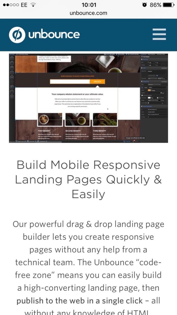
Check out how Unbounce have organized their mobile site below.
Their above the fold content is simple and clearly explains the value of the service. It’s pretty much a carbon copy of that on desktop.

It’s great. It grabs attention with a well designed fold that prompts the user to scroll down.
The first screen after the fold is the below.
There are two things you need to note with this screen.
First, it’s well formatted for mobile. The text is well spaced, readable and not so long as to be intimidating.
Second, they’ve cut a major CTA that’s prominently placed on their desktop page. Head to the desktop site and you’ll notice that these two sections are separated by this testimonial and video CTA.

Instead of using this on mobile they waste no time in getting to the point of their service. Unfortunately I don’t have access to any tests or the analytics data for this page, but I’m willing to bet that cutting the testimonial brought the highest mobile engagement rates.
Take a leaf from Unbounce’s book. Cut out superfluous text. Rid yourself of any copy that doesn’t immediately hammer home the benefits and get straight to the point.
Make Everything Scannable
Getting to the primary message and benefit in your copy is key to building interest, but you also need to know how to present those key persuasive points in a succinct manner.
Mobile attention spans and engagement rates are lower than those on desktop.According to ClickZ, mobile users bounce in one third the time, twice as often and also only visit one third the pages of their desktop counterparts.

Unfortunately ClickZ offers little in the way of explanation here, but I think we’re safe in assuming the lower engagement levels are caused by the very nature of mobile devices and their smaller screen.
The smaller screens of mobile devices can make it difficult to discern the primary benefits of your product/service if there’s a lot of text. If reading your content feels like too much effort, your prospects will become frustrated and just end up bouncing from your site.
You need to tighten every area of your writing to ensure that you’re getting your message across in as few words as possible. Formatting to make the text scannable should also help keep users engaged and on site.
Here are a few tips to get your message across in full, but in as quick a time as possible.
Learn to Exercise Extreme Brevity
Brevity isn’t the act of cutting content. If you’ve got 10 primary selling points to put across, cutting it down to five is only going to harm your message. What you need to do is tighten the writing to get those 10 points across in as few words as possible. Cut everything that doesn’t add to the value of your page.
Keep Sentences Short
Short sentences are easier to read and scan. Your users aren’t going to get bored reading what you’ve written nor are they going to have trouble finding the key point. Keep your sentences short and sweet.
The Same Goes for Paragraphs
There’s no point in having short sentences if you cram them all together in one long wall of text. Keep your paragraphs short as well as your sentences to further facilitate the ease of reading on a smaller display.
Use Bullet Points
Bullet points are the copywriter’s go to approach for getting key points across in bite-size chunks. Here’s a great guide on getting the most out of your bullet points.
Choose Your CTAs Carefully
Push for the sale or sign up. That’s the usual approach with CTAs.
We’re so determined to hit our primary goal that we feel the need to aggressively pursue the sale.
But sometimes that’s just not the best approach.
Mobile use has risen incredibly over the last few years, but there’s still a large number of users who take a cross platform approach. They use mobile devices to begin their purchase journey only to then complete that journey on desktop at a later date.

You can continue to push for the final conversion goal on mobile but if some of your prospects aren’t yet ready to purchase then you risk losing that sale for good.
Set more realistic goals that are specific to the device and your users habits. Instead of pushing for the purchase with an aggressively worded CTA, consider the below which are better aligned with mobile user’s behavior.
– Download the app
– Add to cart for later (follow up email campaign to persuade for the sale)
– Create an account
– Call/locate nearest store
None of the above are pushing for the sale right now, but they give you opportunities to capture details or continue the purchase when the user is ready.
You Mobile Campaign Needs a Distinct Strategy
Your mobile strategy shouldn’t be an afterthought and shouldn’t be left to a responsive design.
Mobile devices are vastly different to desktops and cause users to interact with your site in different ways. You need to know how to optimize your overall campaign to better align with user habits.
When it comes to writing for mobile the best advice is to get to the point as soon as possible. Position your key message in the center of the screen and tighten your writing so your primary message is delivered as soon as possible.
However, remember the tips I’ve outlined are general best practices. Never take the word of a disembodied, online voice as gospel. I’m pretty certain these tactics will help you increase you conversions but you should always take time to properly test each approach.
Draw your own hypothesis for each tactic before implementing and track how it’s received. Rely only on your own results for the future optimization of your campaign. You might find that your audience flies in the face of conventional wisdom and instead prefers long form content on mobile devices. It’s unlikely, but it does happen.
How has the increase in mobile usage affected your campaigns and have you taken any steps to amend your copy?
To view the original article Click Here
No comments:
Post a Comment