
1. Funnel Flow – Visualization and Drop-off rate
The first place to have a quick glimpse for any potential issues is the funnel visualization report, at Conversions > Goals > Funnel Visualization. This Google Analytics report shows the volume of traffic drop-offs at each step of your funnel. For example, here’s a 5-step funnel.
 Enlarge This Image
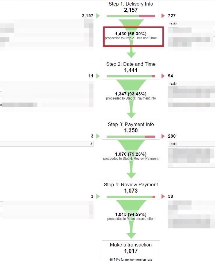
The funnel visualization report shows the volume of traffic drop-offs at each step.
Looking at the above funnel, note that there are drop-offs at each step of this checkout funnel. However, notice that the first step (“Delivery Info”) has the lowest percentage — 66.30 percent — of users proceeding to the next step. It is the biggest drop-off trouble spot and would likely be the first area that would need to be addressed for user experience improvements. Viewing heatmaps of this specific page with your web design and UX team could help isolate the cause(s).
2. Shopping Behavior Analysis
The next place to review (if Enhanced Ecommerce tracking is set up on your site) is the Shopping Behavior Analysis report, which is in the “Conversions” section of Google Analytics reporting.
The Shopping Behavior Analysis report reveals the number of sessions at each stage of your sales funnel, how many sessions moved from one step to the next, and how many visitors abandoned the funnel at each stage. The red arrow at the bottom of each step indicates abandonment values by session and relative percentage — i.e., users drop-offs in the same session. Look for the arrows with the highest percentage points to identify the lowest conversion pages.
 Enlarge This Image
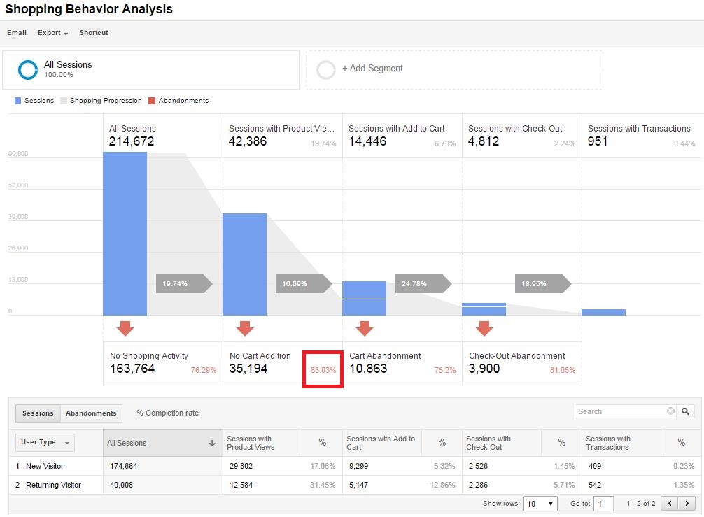
The Shopping Behavior Analysis report reveals the number of sessions at each stage of your sales funnel, how many sessions moved from one step to the next, and how many visitors abandoned the funnel at each stage.
From the screenshot above, we can see that 83.03 percent of users with shopping activity (have viewed a product, product details, promotions) do not add to cart. This is definitely an area to look into and consider different options to improve. Likely questions to ask are “Is the ‘Add to Cart’ button visible enough for users?” and “Are there specific categories of products affected or is this a site-wide trend?”
3. Checkout Behavior Analysis
Then, under Enhanced Ecommerce Tracking, go to Conversions > Ecommerce > Shopping Analysis > Checkout Behavior Analysis. This report further drills down into the funnel by revealing how users have moved through the checkout process specifically. It will help track how many users have moved on from one checkout step to the next, and how many abandoned the process at each step.
 Enlarge This Image
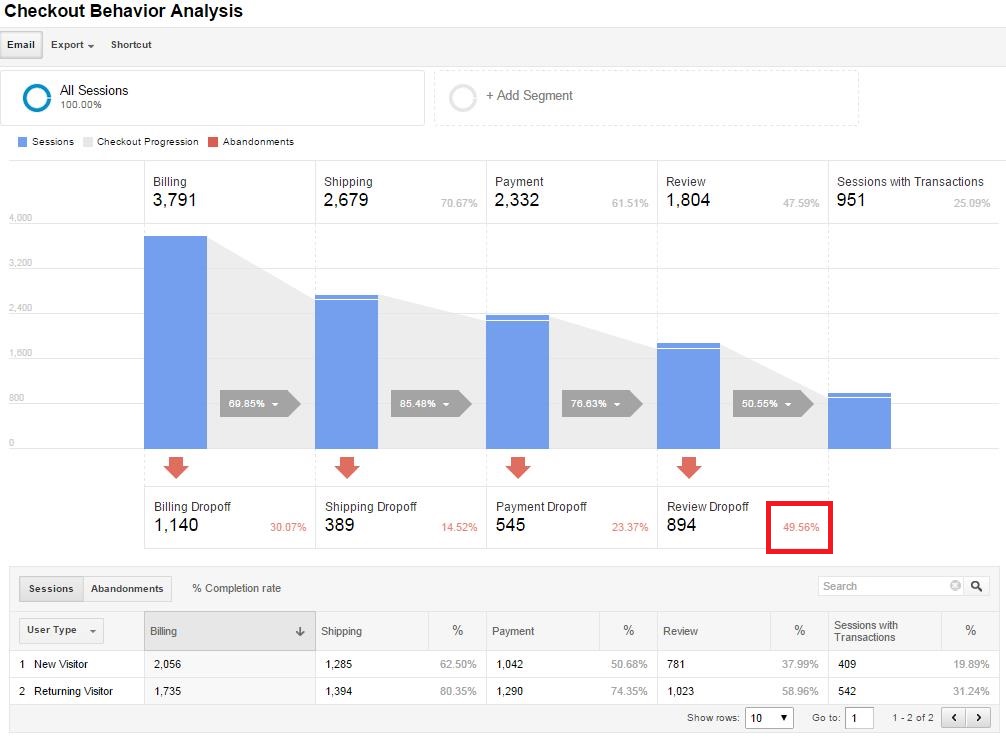
The Checkout Behavior Analysis report reveals how users have moved through the checkout process specifically.
The above screenshot shows that 49.56 percent of users that submitted their payment information dropped off after reviewing their order. Something is definitely up here and not going too well at this stage of checkout. User testing could help to figure this issue out and make the necessary changes.
4. Conversion Rate and Drop-off Rate, per Device Type
Now for the low hanging fruit. You want to see conversion rate discrepancies between devices, at Audience > Mobile > Overview. Broadly speaking, tablets should convert similar to desktops (actually, tablets typically convert 10 percent less than desktops), but smartphones convert on average at one-third to one-quarter of the rate of traditional or tablet devices (but total mobile sales are on the way up since people have more smartphones with bigger screens).
 Enlarge This Image
See conversion rate discrepancies between devices, at Audience > Mobile > Overview.
From the above example, conversion rates on mobile devices are almost five times less than for desktop users. (See on far right: .60 percent for desktop versus .13 percent for mobile.) This is lower than normal. To find out what is not working and needs to be improved, carry out user testing, run tests on different mobile devices, and further drill down conversions by mobile device.
Importantly, remember that roughly 90 percent of users switch between devices to complete a goal. There’s therefore a strong chance that customers are visiting your website on their smartphone and then completing the transaction on a desktop or tablet.
5. Conversion and Bounce Rate per Screen Resolution
Comparing bounce rate and conversion rate per screen resolution can give hints about web design problems.
 Enlarge This Image
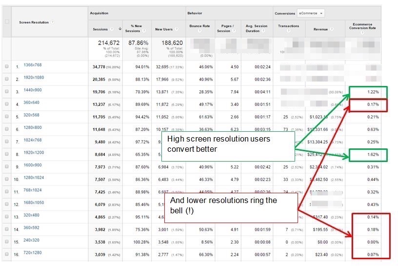
Users with lower screen resolutions often have lower conversion rates.
The above report — Audience > Technology > Browsers & OS and then change the Primary Dimension, on the top right, to “Screen Resolution” — shows us that users with lower screen resolutions have lower conversion rates as compared to high screen resolution users. It could mean either that high screen resolution users have simply more money and are more likely to convert or that user experience on low-resolution devices needs to be improved — or both.
6. Conversion Rate and Drop-off Rate per Browser
One of the most common reasons for conversion drops would be the incompatibility of a site with some (even major) browsers.
For example, look at the conversion rates per browser and browser version in this screenshot below, which is at: Audience > Technology > Browsers & OS and then add the Secondary Dimension “Browser Version.”
 Enlarge This Image
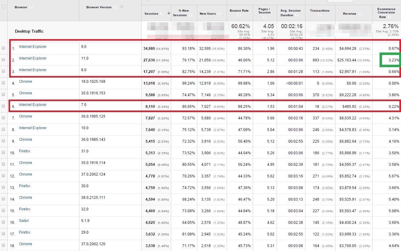
A common reason for conversion drops is the incompatibility of a site with various web browsers.
First, look at the above report by device category separately. So the view should be desktop only, tablet only, or mobile only.
Second, what can we learn from the above report? Internet Explorer 11.0 converts at 3.23 percent while version 8.0 is 0.66 percent; version 9.0 is 0.67 percent; and version 7.0 is 0.22 percent. Ask your tech team to look into the user experience on IE 8.0 and 9.0 for desktop devices. Apply the same logic to other browsers and their versions.
7. Bounce Rate per Landing Page
Now, let’s consider landing pages by going to Behavior > Site Content > Landing Pages. If you drive paid traffic to your site, this is especially critical — look at the “paid traffic” segment separately.
 Enlarge This Image
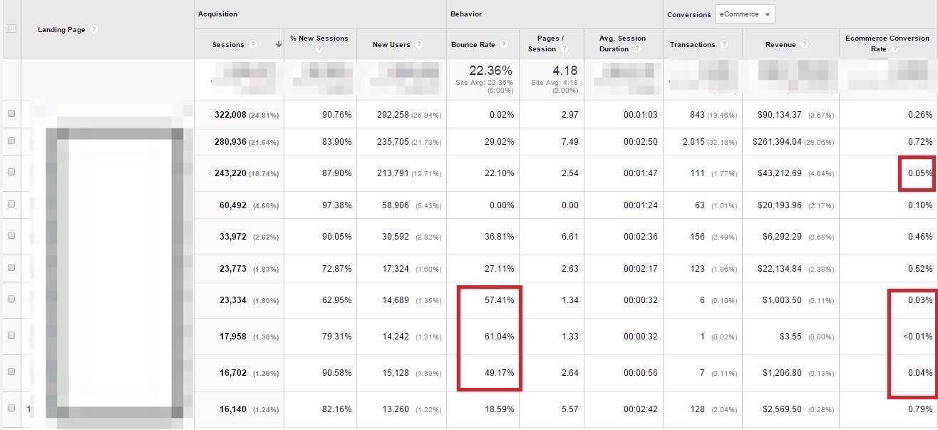
Analyzing traffic to landing pages helps determine which ones have a higher-than-average bounce rate and low conversion rates.
Which (high-traffic) landing pages have higher-than-average bounce rates and a low conversion rates? These two metrics usually correlate.
Once you can separate the top performers from sub-optimal ones, take action to:
- Either fix issues on the identified pages or fix the quality of your traffic source(s);
- Stop sending traffic to the affected pages — instead send traffic to the high-performing pages.
8. Exit Rate per Page
This is very similar to bounce rate by landing page. Look for the pages with a higher-than-average exit rate — i.e., the percentage of users that leave the site from that page. To view the Exit Rate per Page report, go to Behavior > Site Content > All Pages; change your chart type from “Data” to “Performance” and then chose the dropdown option “Exit” on the second column.
 Enlarge This Image
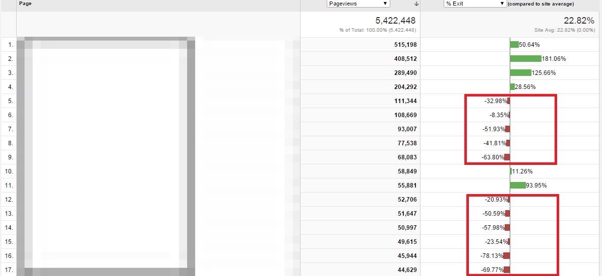
Look for pages with higher-than-average exit rates.
This is a nice, single-glance view to identify under-performing pages. Compare high-performing pages to under-performing ones, and see if you can determine the differences.
9. Page Load Time
Site speed matters. Some pages on your site will be inevitably slower than others. Find out by looking at Behavior > Site Speed > Page Timings.
 Enlarge This Image
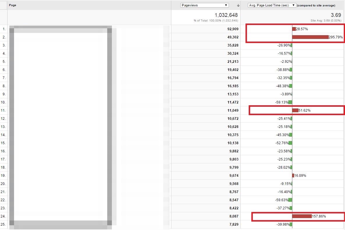
View the download speed of any and all pages on your site, at Behavior > Site Speed > Page Timings.
Isolate pages with above than average page load time and have your developers work on decreasing page load times.
10. Conversion Rate per Product
Another place to look for useful information is the Ecommerce > Product Performance report.
Find out the products that have a below average “buy-to-detail” rate. (Google Analytics now calls a “product page” a “detail page.” The buy-to-detail rate is the total unique purchases of a product divided by the product-detail page views.)
Find out the products that have a below average “buy-to-detail” rate. (Google Analytics now calls a “product page” a “detail page.” The buy-to-detail rate is the total unique purchases of a product divided by the product-detail page views.)
 Enlarge This Image
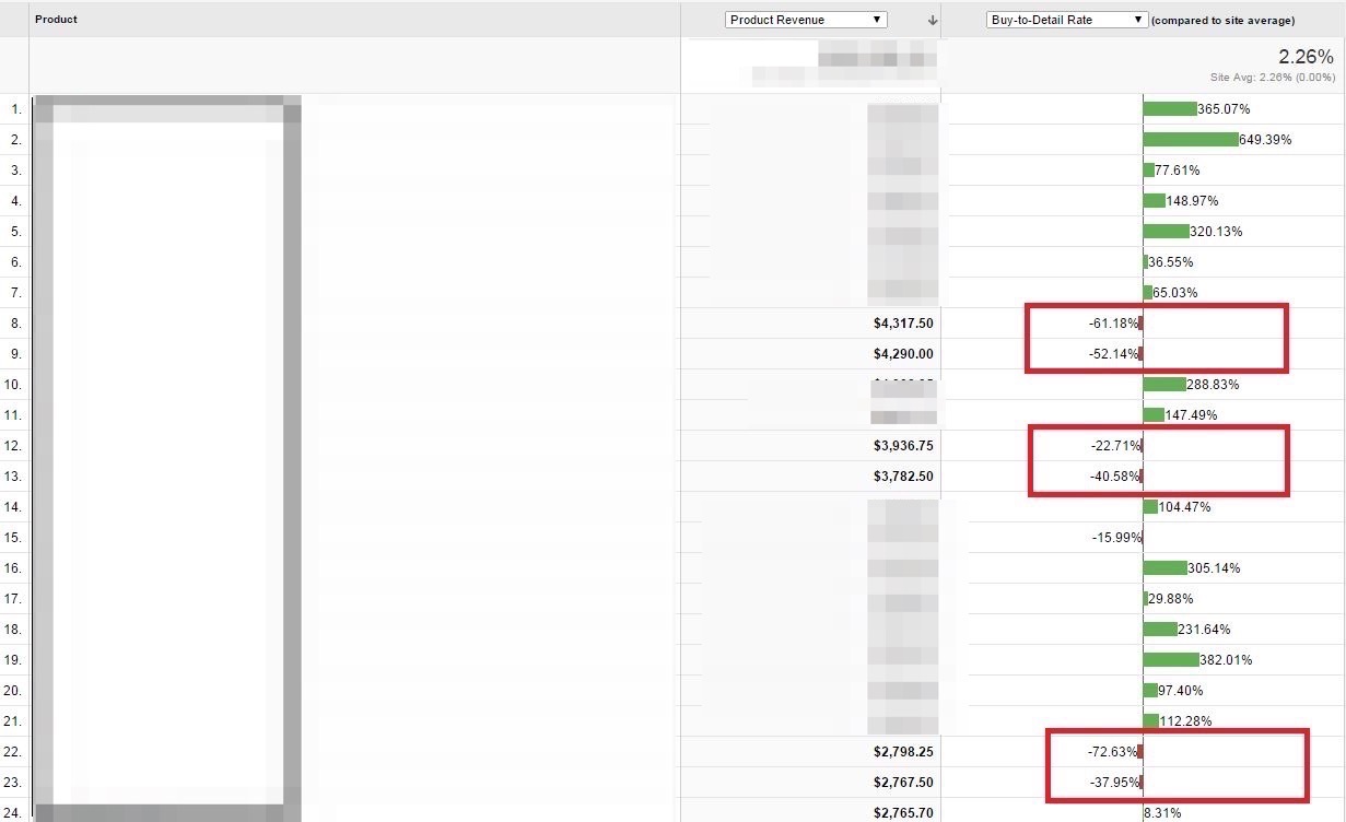
Buy-to-detail rate equals unique purchases divided by views of product-detail pages.
Carry out user testing to learn about the issues that your customers may have when viewing products with a low buy-to-detail rate. Compare these products to products that convert well, to determine changes.
Conclusion
Before you carry out any testing on your site, be sure to look at all the data from Google Analytics to identify potential problems pages or sections, which can cost you conversions and sales.
Remember, data doesn’t tell you what to do. It’s your job to pull insights out of the data you see. Fixing the problems always starts with finding where they are located. Once you know that, you’re one huge step closer to coming up with split tests that might make a difference, to make more money.
If you liked this article you may also like:
To view the original article Click Here

No comments:
Post a Comment