I love exit-intent popups.
I know, I know. They get a lot of hate. People complain about how annoying or irritating they are. But here’s the thing – they work!
We already know that attention spans are low. People land on your site, browse around for a bit or read a blog article, and then they leave. Cart abandonment and bounce rates are high. Add to that our short memories and most people who leave may never come back.
Unless you try to give it one last shot, a Hail Mary if you will. Because you have nothing to lose.
Your visitors are already on their way out, they have signaled their intent to leave and their attention is quickly being focused elsewhere. Your options are to do nothing, and perhaps never be able to count them as a returning visitor, or take your best shot, display a popup, and try to convince them you are worthy of their time.
Here’s the catch – your users are smart, and if you simply throw up some generic image and CTA, they are going close the window and never look back. Just like everything else on your site, your popups need to be optimized in order to yield the best results.
In this post, we’ll look at the 4 components of exit-intent popups and how to optimize them.
1. Targeting
Targeting, or segmenting, is vitally important to making sure the right message reaches the right user. Just like matching landing pages to the source from which they originate, you want to make sure the popup that a user sees matches the section of your site from which they are leaving.
For example, if a user leaves from the ecommerce part of your site, meaning a conversion equates to them making a purchase of some sort, you might followFive Four Club’s lead and offer a discount in return for their email:

On the other hand, if they depart from the content or blog section, you might make like Optimonk and display a popup that’s relevant to what they were reading:

The worst thing you can do is display something that has nothing to do with a user’s session. For instance, since you’re reading this post, I imagine you’re interested in conversion rate optimization. Showing you a popup for a book on web development would not make any sense, but if the book was on CRO you might be inclined to download it.
Remember, it’s likely that the user’s focus is already waning, so the easier you make it for them to relate the popup to what they were doing, the better your chances are of converting them.
2. Design
Remember what I said about avoiding generic images? Quality popup design is all about meeting your visitors’ expectations, meaning it should fit the style and theme of your site. The best ways to achieve this are to use colors, fonts, and images that are similar to your main site. Anything too different will detract from the message that you are trying to convey.
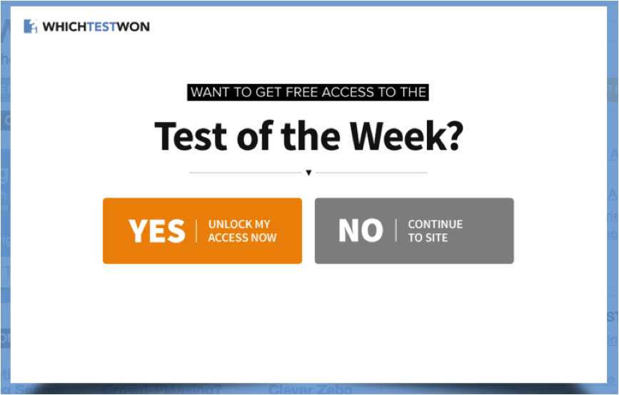
To see what I mean, check out the homepage and popup for Which Test Won:


Look at how well the design elements match between the two – the logo is in top left, the white text against black background is the same, and they both include the color orange. These elements create a super smooth transition between site and popup, which allows the user to focus on the message.
Other design options to consider are going full screen like Quicksprout:

This literally removes all other distractions and meshes well with his simple message: follow me on Facebook.
Also, removing the X-to-close button like Clarity is an easy way to encourage one last look at the popup:

What’s interesting about this is that people expect to see the ‘X’ in the top-right corner, but instead they see, “Wait – Don’t leave empty-handed!”
This forces them to look at the rest of the popup to find where the close button is. Sure they can click away or choose “No thanks,” but the absence of the close button will give your popup a bit more time to work its magic.
3. Copy
I cannot overstate the importance of quality, relevant, and straightforward copy. Even if you do everything else wrong with your exit-intent popups, getting your copy right will win you some conversions.
Now is not the time to be long-winded or vague. There’s really no space for that on a popup. Plus, your visitors are already losing interest, so you need to focus on getting your message across with as little interference as possible.
There are two things you need to do when writing popup copy: focus on the offerand personalize whenever possible.

This is a great example from Conversion Scientist on how to focus on the offer. The hard-to-miss title says it all – in return for your name and email, you will get a free conversion crash course. Even if you don’t read the details, you still know what it is.
Personalization is another tactic worth implementing, but in this case I don’t mean matching the information to the user. What I mean is incorporating personal pronouns to speak directly to the user and making your copy sound conversational.

This popup is a great example of speaking directly to your users. It almost mimics an actual conversation in a retail store. You can imagine a sales rep coming up to you and asking you if you want a discount on your purchase, and you answering with the given options.
4. Calls-to-Action
Calls to action are the last link for the popup conversion chain. Your users have presumably been compelled by your offer, filled in some information, and are now ready to seal the deal. The worst thing you can make them do now is think twice, so your CTAs need to drive the point home without causing confusion.
Maintain Your Message and Theme
Now is not the time to change things up and introduce some crazy color or terminology. You want to keep the user focused on what they are about to gain by tying in your CTA with the rest of the popup.

Backlinko does just that by pretty much repeating the same copy in both their popup body and CTA. If a user was interested the first time they saw the message, I doubt seeing it again is doing to change their mind.
Guide Their Decision
While it’s true that your users will make the final decision on whether to convert or not, there are things you can do to influence their choice. The first is by increasing the visibility of the choice that you prefer them to make.

If you look at the color scheme of this popup by Social Triggers, it’s almost entirely black and white with one exception – the CTA that triggers a conversion. You’d have to be blind to miss it. It was the first thing I looked at when I saw this popup. Bonus points for making the opposite choice as bland and boring as possible.
The other thing you can do is creating a negative call to action where a negative effect is implied by not converting.

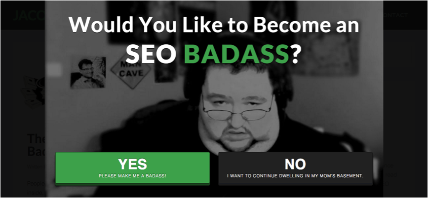
I love this popup.
While it’s not clear what you will receive by clicking yes, it is clear that you will continue to dwell in your mom’s basement if you click no. It goes without saying that this is a joke, but the effect is the same – click yes and be awesome, click no and be boring.
Wait! Before You Go…
See what I did there? Now that you’re done reading this article, you’re probably going to leave. But before you go, I have a call to action for you. All you have to do is implement an exit popup on your site and report back here in the comments with the results. If you already have one, tell me how it’s working out for you.
To view the original article Click Here

No comments:
Post a Comment